On Monday (12/10/15) we were put into pairs to give feedback on the 10 themes we came up with. I admit that I hadn't actually managed to illustrate all 26 ideas for each theme - I had trouble managing my time, which is something that I identify that I need to work on.
However, from the themes that I could show Megan (my partner) drawings for, the main feedback she gave me that I took into consideration was that I should maybe try different media or colour more often, to see if ideas work better that way. I can get stuck into using black pen quite often. However, I did try to just draw straight onto paper with pen without using pencil first, which I managed sometimes.
Another thing I found myself doing was getting very into one idea and wanting to draw perfect drawings for each letter - I did this with my favourite songs idea, which is probably why I found that I ran out of time to draw the other themes. I need to focus more on getting the idea down on paper rather than a perfect final piece.
I had gone into the crit thinking I knew which idea I wanted to pursue (favourite songs), but after talking to Megan, I realised that actually, drawing my favourite bands would make the poster more relatable to other people, as they are more likely to know the bands than the songs, but will still be personal to me.
My favourite 3 ideas were favourite songs, favourite bands and art school stereotypes (.i.e. people you find in art school). Some of my favourite pages:
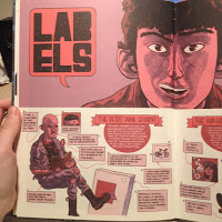
I used my iTunes library (6000 songs) to find bands and songs, and the starting point for research for the art school stereotypes was Art Schooled by Jamie Coe, a graphic novel about the author's time at art school - I own this book and knew that there were some illustrations similar to what I wanted to convey in there.
I did a google search for similar illustrations and found Jesse Acosta's work which had some interesting ideas (more at: http://jesseacosta.blogspot.co.uk/2014/08/the-16-different-types-of-art-school.html)
And finally - Colleen Clark, which make more sense with the context writing behind the images (http://www.ccad.edu/blog/2014/01/the-11-people-youll-meet-at-art-school/). The first one is 'The Vampire' and the second is 'The Scary Looking Dude With a Heart of Gold'.


No comments:
Post a Comment