1.
Which practical skills and methodologies have you developed within
this module and how effectively do you think you are employing them within
your own practice?
|
|||||
·
Experimenting
with different media - particularly Photoshop, expanding from the Visual
Language workshops, seeing how images work in different formats. Going back
to using paint again instead of focusing on inks - sometimes ink isn't the
best fit and it helps to experiment.
·
Roughs/ideas
generation - previously I've been used to generating ideas in my head and
writing them up as lists or brainstorms rather than presenting them visually,
but having to do roughs helped me realise getting ideas down visually is a
big help, particularly in Brief 1 where I realised I couldn't actually
illustrate (well) some ideas for each of the 10 themes.
·
Blogging -
having to write down that mental conversation with myself helped me realise
further things about my own practice by getting down the jumbled thoughts in
my head into a clear presentable format.
·
Loosening up
my drawing by working to a small timeframe - similar to roughing, not being
so precious about my drawing, as it's more important to get ideas down rather
than being concerned with having perfect illustrations in the early stages.
|
|||||
2. Which principles/ theories of image
making have you found most valuable during this module and how effectively do
you think you are employing these within your own practice?
|
|||||
·
Limitations
on colour and size/format across all the briefs helped me to realise that
sometimes the more simple illustration is better for that particular brief,
and it helps to make the mistake of drawing something too complex and
simplifying it. I even decided to stick to a limited colour palette for the
third brief even though there were no formal restrictions because of this.
·
Looking at
other artists' work, relating to PPP and my new Pinterest account - helps to
see how other artists create their work and apply the knowledge of
professional practitioners to my own practice.
|
|||||
3. What strengths can you identify within
your submission and how have you capitalised on these?
|
|||||
·
Authorship -
my personality and interests definitely show across each of the 3 briefs,
which I think helps set me apart from illustrators similar to me.
·
Character
design - something I'm very passionate about and interested in pursuing. I
find that more often than not when I'm presented with a brief I somehow subconsciously
(sometimes consciously) find a way to
include character in my imagemaking. I think my character design is fairly
individual and unique to me.
·
Drawing
confidence - my confidence has definitely grown in my own drawing,
particularly my sketchbook work and roughing. I'm less worried about having
perfect illustrations on every sketchbook page, and am now more focused on
just getting ideas down, which I think begins to show over the course of my
sketchbooks for Visual Skills.
|
|||||
4. What areas for further development
can you identify within your submission and how will you address these in the
future?
|
|||||
·
Time
management - falling back into old habits of not prioritising/organising my
time effectively and staying up very late on Sunday nights in Briefs 1 and 2.
Identified and fixed this for Brief 3, but will need to stay on top of this
by doing work as soon as it's set, organising a social life around work and
getting a good night's sleep more often than not.
·
Improve my
rough drawing and do more! I can still overcomplicate my roughs and there is
always an opportunity for me to do more, even if it's just a doodle on the
bus. I need to get into the habit of taking a sketchbook everywhere.
·
Blogging -
blog every day! Also use bullet points! I come from an English/essay-writing
background so I'm always tempted to waffle on, but bullet points can help me
to just get the main points down.
·
Continue
experimenting with media for every brief to see what works well and what
doesn't, even if I do use the first idea/media I wanted to.
|
|||||
5. In what way has this module introduced
you to the BA (Hons) Illustration programme?
·
Helped me
get to grips with blogging - definitely evident on my blog that I'm getting
more used to it as time (and briefs) wears on.
·
Helped me
get used to the structure my life has now and how much work I'm getting and
need to do every day.
·
Has helped
me get to grips with using resources like Photoshop and the library that are
available to me to help with each brief.
·
Introducing
me to basic illustration skills like roughing that will underpin my practice
for the rest of my professional life.
·
Crit
sessions have really helped me start evaluating and reflecting on my own work
in a friendly and constructive environment, and I look forward to these
opportunities to have my peers help me figure out which path to progress on
for each brief.
|
|||||
6.How would you grade yourself on the
following areas:
(please indicate using an ‘x’)
5= excellent, 4 = very good, 3 =
good, 2 = average, 1 = poor
|
|||||
1
|
2
|
3
|
4
|
5
|
|
Attendance
|
X
|
||||
Punctuality
|
X
|
||||
Motivation
|
X
|
||||
Commitment
|
X
|
||||
Quantity of work produced
|
X
|
||||
Quality of work produced
|
X
|
||||
Contribution to the group
|
X
|
||||
The evaluation of your work is an
important part of the assessment criteria and represents a percentage of the
overall grade. It is essential that you give yourself enough time to complete
your written evaluation fully and with appropriate depth and level of
self-reflection. If you have any questions relating to the self-evaluation
process speak to a member of staff as soon as possible.
|
|||||
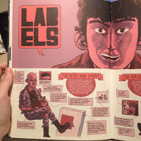
Showing posts with label OUIL403 Visual Skills. Show all posts
Showing posts with label OUIL403 Visual Skills. Show all posts
Monday, 16 November 2015
OUIL403 Visual Skills Final Self Evaluation
Saturday, 14 November 2015
Visual Skills Brief 3 Evaluation

Finished book cover for 'The Beauty Myth: How Images of Beauty are Used Against Women' by Naomi Wolf.
What went well
- I managed my time a lot better during this brief - not staying up until 5 in the morning on Sunday night/Monday morning to finish work that I should have made time for before.
- Using a different media - I usually stick to inks, whether in a pot of a pen, but I think the gouache works well here, almost emulating digital with flat opaque colour, but still having a nice handmade quality.
- The colour scheme - simple is often better. Although we didn't have limitations on colour for this brief, I still chose to limit my palette because it actually looked better than using a larger range.
- The composition in general - I think the final image is well-crafted and looks like a real book cover.
Difficulties
- Not enough experimentation in the early stages - identified during the crit that I could have come up with more ideas and developed my roughs a bit more with colour and media rather than just pencil.
- I'd hoped to focus on digital methods for this brief since I didn't experiment much with it before, but due to not having a print induction yet I realised it might be difficult to produce the whole cover digitally without paying through the nose for it.
What I would do differently next time
- Play around with media and colour for different ideas before picking one final one.
- Maybe start finalising the design earlier so I had more time to think about printing a final digital image.
- Think about the type more - position and font, as although I like the hand drawn quality, I didn't experiment with different fonts and positionings.
Overall, this was probably my favourite brief of the three, as although it was a non-fiction book, I could still play around with the narrative element behind the content of the book and come up with a suitable image with character and deeper metaphorical meaning.
Thursday, 12 November 2015
Visual Skills Brief 3 - More experimentation

Media - gouache. I like the way gouache dries matt and opaque. Better than watercolour or acrylic paint. Emulates digital almost, but still has a handmade quality which I like.
Not sure about the blue line here - wanted to try something other than black. I think I used the wrong hue of blue though - may work better if it's a darker turquoise rather than ultramarine.
I don't think this hand position works either - there's more detail but I think it looks too awkward? Right hand facing away works better.
 I enjoyed producing this digital version! However I still like the handmade quality of gouache paint, and I'm also not sure how to go about printing the whole book cover on one piece of paper as we haven't had our print room induction, and I also don't want to pay a huge amount in town. I like experimenting with texture and gradient though - I like how the gradient makes it look like there's a light source, making the shadow on her face more appropriate. But I also think it works well just being flat dark colour - it's simpler and more eye-catching if there's less detail.
I also prefer the hand drawn type I can do in analogue media. I could spend more time creating my own font or searching for a suitable font online but since I don't think I'm going to produce the cover digitally, there's not much point. Although I can't emulate highlighter pink with gouache (which I originally thought would look good contrasting with the blue), it might actually suit a baby pink more, since it's more feminine and goes with the word 'beauty'.
Tuesday, 10 November 2015
Visual Skills Brief 3 Development
 Playing around with colour - initial thoughts went to purple as it contrasts to orangey skin tones. However I thought that colour palette looked too comic-like for this particular book cover, and took focus away from the pink title type. I picked pink because it's a classic colour associated with femininity/beauty. So then I experimented again with darker purple, but still thought it looked wrong and I wanted the snakes to be green or another cool colour, so there were too many colours and it needed to be simplified.

Playing around with media/colour for snake skin. Tried again with blue/turquoise colour palette. I think this works better for the context of the book as blue is often a negative colour, and also suits the Medusa 'monster' figure. Creates a good sense of light and tone. I also swapped the image around so that the snakes extend to the back of the book, as I was having trouble coming up with ideas for the back cover and all my ideas were too complex. From the crit, Jamie suggested this as it's simpler and it does work.
 I experimented a bit with different patterns/mark-making and colour to see what looked best for the snakes. I think the brighter greener turquoise doesn't work as it doesn't fit the palette well - I think it'll work better if the snakes are a different value of the same initial colour, or maybe the dark almost grey muted green. I like the patterns on the half-finished snakes - the ink overlay and the unjoined scales on the snake with its mouth open. With the ink overlay I would probably make it darker.
 I think it looks good though if all the snakes are slightly different colours.
 I think the blue tones work better with the pink title too - it's easier to see compared to the more realistic colour palette I started out with because it contrasts. I liked using gouache for the type aswell because it dries opaque and matt, better than acrylic or watercolour/ink. However, I might take this design into digital, where it will be easier to make it stand out thanks to layers!
Monday, 9 November 2015
Visual Skills Brief 3 Crit


What was good
Everyone agreed my favourite two ideas were the best - the first and last images. The concepts are the clearest and they illustrate what the book's about well.
What I can improve
- Instead of having separate images on the back cover, extend the front cover image - i.e. swap the face direction in the first one and have the snakes extend to the back cover. I agree this is a better way of illustrating the back. For the last one similarly have the tape measures extend to the back. I think different sizes would also be good, different widths of the tape measures.
- More drawing/development! I think although I did develop the ideas a bit in my sketchbook, I could have introduced colour and media instead of just focusing on roughs, to get a better idea of how the final cover would turn out. However, I had trouble choosing an idea and didn't want to start developing using colour etc. until I'd picked one. But I'm still having trouble so maybe experimenting with colour will help me choose.
- Reference pictures - I did use reference pictures of myself and a mirror to draw the pose in the last on and the mouth in the first one, but I didn't add tape measures.
What I'm going to do now
- Draw more - work out the ideas better and pick one
- Introduce colour and different media to understand better how I will produce the final image
- Buy some tape measures and get reference pictures of someone actually being constrained by tape measures
- Draw snakes from reference
Wednesday, 4 November 2015
Visual Skills Brief 3 Initial Ideas
Initially from the title 'The Beauty Myth: How Images of Beauty are Used Against Women', I thought of models and sexist/misogynistic advertising, but these ideas seemed pretty cliche and boring.
 The word 'myth' immediately made me jump to female mythical creatures, like the gorgon (Medusa), sirens (who lure men to their death at sea with beautiful singing), harpies and banshees etc. I thought I could use the siren quite well - similar to models/advertising luring women into insecurity, but I like the idea of the gorgon - obviously looking at a gorgon causes people to turn to stone, which is quite a good metaphor for women looking at images of 'perfect' women on a daily basis and getting more insecure - i.e. set in stone (get it?!). I thought this could work quite well also if the gorgon was looking at her own image in a mirror, as it sums up the book's contents pretty well.

 On the back cover I thought it could be interesting to have a hand smashing the mirror - escaping from that trap of idealising 'perfect' women and belittling ourselves.
Or a model being as equally disgusted at her own image as the ugly gorgon, showing how images or 'perfect' women can affect every woman.


Monday, 2 November 2015
Visual Skills Brief 2 - Final Evaluation


My final 3 editorial illustrations for the article 'The age of loneliness is killing us'.
I found this brief quite challenging, although fun too. Initially I came up with quite a few ideas for each piece, but I know I may have focused too much on one idea that may not have actually been the best way forward. The first image of the man running towards his family and away from a pile of smashed computers was born from a singular phrase in the article - 'lone ranger' - which was identified as being too distant from the article and overcomplicated in the first halfway point crit. Although I tried to edit the idea to fit in with the article more, I think got too caught up in the narrative aspect which was unnecessary for this brief. In the future I need to be confident enough to scrap ideas that I may have loved at the start but in the end are inappropriate.
I think the design and concepts of my images work well, as by looking at them you can tell what the article is about, particularly in the latter two. The colour I used suits the article, as blue is a colour often associated with sadness, loneliness and even social media, which the article gives reference to briefly. However, the yellow and orange in the first one, as I mentioned, was more me trying to present a narrative happy ending, which didn't really work well.
I did initially want to use Photoshop for this brief, but in the end didn't manage my time very well, which I need to improve on. I experimented with watercolour initially, which now that I look back, could have worked better for the article I had, as the wash effect actually seems more vulnerable and 'sad'. I chose to use Copic markers and coloured fineliners, which do have an aesthetic appeal. Even though you can see some of the pen marks, I think it actually suits the article, as it has a sort of broken and messy quality, fitting the tone of the article.
I found the concept of roughing very useful in this brief - just getting ideas down and not worrying about getting the perfect drawing. It was quite hard to draw 'badly' at first, but the concept has really grown on me and it's definitely useful for figuring out composition without being too precious.
Next time I definitely want to experiment with more media, and even though I believe I came up with quite a lot of initial ideas, I could always do more! I definitely need to manage my time better too. I identified this in the last brief and have failed to act on the information.
Thursday, 29 October 2015
Visual Skills Brief 2 Further Development
After the crit, I decided that this idea needed to be developed and simplified a bit, as the original lone ranger was a bit too confusing and separate from the other ideas. So I decided to change the character to the same guy in one of my other ideas - a man making paper chain 'friends' out of bank notes. But this is like his happy ending, getting away from technology and social media and going back to spending time with real people. I think I'll do this one in yellow and orange ink.


Monday, 26 October 2015
Visual Skills Brief 2 crit
Today we had a crit of the 9 roughs (3 for each dimension) we produced for this brief. These are the 9 I presented:


After answering some personal evaluative questions about our own pieces, we got into pairs with someone who didn't know our article to see if they could clearly see what was going on in each piece. This was a helpful exercise as it made me realise that I might actually need to communicate some ideas more clearly. However, the 3 ideas I had in my mind that I wanted to do, Louis could tell what they were communicating.
After this, we grouped back up with people who did have the same article to give more helpful feedback on what could be done to improve our ideas. However, my favourite idea, the lone ranger one, both girls in the group agreed it was too complicated and distnat from my other ideas, which I had to agree with. So I'm still going to pick that one but simplify it and try to connect it to the others more, maybe with the same characters in all 3 illustrations.
Thursday, 22 October 2015
Visual Skills - Brief 2 Initial Ideas
The article I've been given for this brief about editorial illustration is titled 'The age of loneliness is killing us', and it's about the increase in depression and loneliness as we become more reliant on technology. One idea I've had for one of three final pieces is the idea of a lone ranger - the article mentions people becoming more focused on individualism and compares them to lone rangers. I thought I could use this to create an interesting piece, where a lone ranger is walking away from a pile of smashed computers, insinuating that social media and technology takes ahold of our lives and we become too obsessed with this virtual world, but even if you sever ties with it you can still feel isolated.


This is some initial experimentation with the idea. After speaking to Pete, he agreed that having the character smaller if more effective in conveying loneliness, with the vast empty space around him. However, he also said that maybe the sunset in the distance suggests a happy ending - which got me thinking that maybe I could turn it around and have it as a 'happy ending'? The article is overwhelmingly biased and negative towards technology and doesn't offer up a solution aside from - 'we must confront the world-eating, flesh-eating system into which we have been forced', which could be conveyed by this illustration - the lone ranger leaving technology and virtual people behind and going back to community.


Here's some more playing around with the idea, bringing colour in. In the first one I got rid of the sunset, but I didn't actually like how dark it was. Although that could represent depression, I thought it filled the space too much to be considered 'lonely', so I drew it again this time using blue line and lighter blue washes. I thought that worked better. In the third image I tried to convey that 'happy ending' idea by using yellow and orange, and I actually liked this idea better.
Wednesday, 21 October 2015
Typology Brief Evaluation

I was happy with the humour I put into the ideas - it may not be everyone's cup of tea but I make myself laugh at least, and it shows some of my personality. I also think it was a good decision to include the typeface of each band's logo, although it added a bit of work. I think it conveys the variety of genres of bands that I listen too, as well as being more interesting to look at than just picking one font. Finally, I think some of the ideas are actually quite original in their approach, and even if someone else had done a similar poster, they wouldn't have come up with the ideas that I did for each band.
I struggled a little with ideas development in the early stages of the project - for some of the 10 themes I got a little bored once I actually started drawing the ideas and realised I couldn't come up with interesting concepts for each letter. I know I also should have focused more on quick drawings, rather than getting so caught up in drawing perfect drawings for the themes I found most interesting. Again, once I get an idea in my head, I want to get it down perfectly the first time, rather than spending more time drawing it out roughly multiple times first. I need to work on that, and I have actually found it useful to work things out more like that since coming to LCA.
There are a few things I would do differently if we were to start the brief again. Firstly, I would definitely develop some ideas further - some of them I feel were quite obvious and not as imaginative as they could have been, but I did feel a bit pressed for time. Which brings me on to another thing I would improve - time management! I need to get the balance of work, social life and sleep right. I would also try to gather more reference material or do some more observational drawing for things like poses and characters - I didn't think too much about the characters I presented in the final poster.
We also did a group crit, and most comments were positive. After I explained the ideas behind the layout and colour among other things, everyone in the group agreed that black and white (and grey) were probably the best colours to use for my particular theme, as all of the bands are different genres and perhaps different colours wouldn't have suited the drawings for all the bands. However, I could have experimented more with colour in my sketchbook to test this. Again, the composition is mostly clear, apart from a couple of instances where some band names seem to connect to other drawings - I think it's clear though from looking at the drawing and band name which ones pair off. One question the group asked me was did I consider other compositions? I did originally do a plan in my sketchbook based on phone keys - i.e. 8 rows of drawings similar to a phone keypad layout, ABC on row 1, DEF on row 2 etc. However, doing this in my sketchbook obviously didn't translate well to A2! So I started trying to figure out where each drawing would fit on the page on a test A2 sheet, and then used another sheet of A2 to move things around a bit and confirm where each drawing would fit.
Sunday, 18 October 2015
OUIL403 Visual Skills Typology Crit
On Monday (12/10/15) we were put into pairs to give feedback on the 10 themes we came up with. I admit that I hadn't actually managed to illustrate all 26 ideas for each theme - I had trouble managing my time, which is something that I identify that I need to work on.
However, from the themes that I could show Megan (my partner) drawings for, the main feedback she gave me that I took into consideration was that I should maybe try different media or colour more often, to see if ideas work better that way. I can get stuck into using black pen quite often. However, I did try to just draw straight onto paper with pen without using pencil first, which I managed sometimes.
Another thing I found myself doing was getting very into one idea and wanting to draw perfect drawings for each letter - I did this with my favourite songs idea, which is probably why I found that I ran out of time to draw the other themes. I need to focus more on getting the idea down on paper rather than a perfect final piece.
I had gone into the crit thinking I knew which idea I wanted to pursue (favourite songs), but after talking to Megan, I realised that actually, drawing my favourite bands would make the poster more relatable to other people, as they are more likely to know the bands than the songs, but will still be personal to me.
My favourite 3 ideas were favourite songs, favourite bands and art school stereotypes (.i.e. people you find in art school). Some of my favourite pages:


I used my iTunes library (6000 songs) to find bands and songs, and the starting point for research for the art school stereotypes was Art Schooled by Jamie Coe, a graphic novel about the author's time at art school - I own this book and knew that there were some illustrations similar to what I wanted to convey in there.


I did a google search for similar illustrations and found Jesse Acosta's work which had some interesting ideas (more at: http://jesseacosta.blogspot.co.uk/2014/08/the-16-different-types-of-art-school.html)


And finally - Colleen Clark, which make more sense with the context writing behind the images (http://www.ccad.edu/blog/2014/01/the-11-people-youll-meet-at-art-school/). The first one is 'The Vampire' and the second is 'The Scary Looking Dude With a Heart of Gold'.


I did a google search for similar illustrations and found Jesse Acosta's work which had some interesting ideas (more at: http://jesseacosta.blogspot.co.uk/2014/08/the-16-different-types-of-art-school.html)

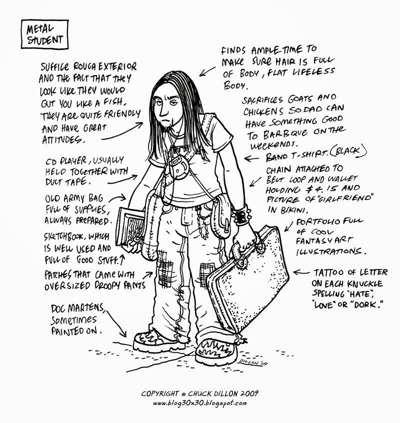
And finally - Colleen Clark, which make more sense with the context writing behind the images (http://www.ccad.edu/blog/2014/01/the-11-people-youll-meet-at-art-school/). The first one is 'The Vampire' and the second is 'The Scary Looking Dude With a Heart of Gold'.


Subscribe to:
Comments (Atom)