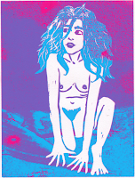
I was struggling between the colour of the extra texture I added to this image, but I think there's more balance in the image if the extra foreground layer is blue, otherwise the blue hair looks quite out of place, and just stuck on randomly in the middle.
Now that I've added more texture to the background as well, I think the blue foreground was definitely the right choice, as if the new monoprint texture was blue, it clashed with the hair. There's definitely more of a balance of colour with these choices.
I added a title! Not sure if I'll keep it as the final, but it's something!


No comments:
Post a Comment