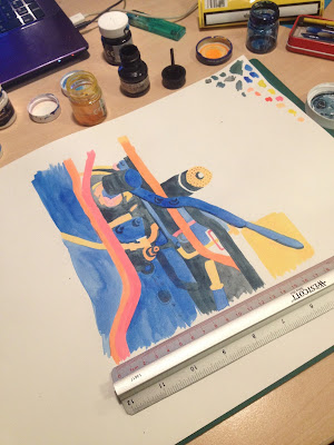
I recently treated myself to Micah Lidberg's concertina book, Rise and Fall, and gained some inspiration for my own book from his work. The colour scheme in particular really grabs my eye, and I started playing around with similar colours in another drawing of train mechanics.
I used Copic markers again, and was still focusing on shape, rather than line drawing. I think if I do this piece bigger than the size of my book (I'm thinking 150mmx150mm), then I can shrink it down using Photoshop so it will look more detailed than it actually is. This will help me to stop being such a perfectionist about my work.
I then decided to experiment with collage and cut paper, since we'd just been doing this in Visual Language:
This one didn't quite go as I wanted - I started drawing the bits I wanted dark blue in black on white paper because I couldn't find any dark blue paper in the studio, and the lighter blue paper was slightly transparent, so I thought it would show through quite well. Originally I was cutting out the shapes in dark paper but figured drawing would take less time, and you wouldn't be able to make out too many mistakes anyway. However, when I started on the coloured layers, it was harder to make out the under layer (I hadn't copied it or anything - I should have) so it was hard to get the shapes right.
So, new approach!
With this one I decided it would be best to build up the layers by cutting them out with a scalpel. However, after all these intricate cuts, I got blisters on my hands and it hurt to continue. I also used Pritt stick, and in hindsight should have invested in some spray mount. Even though it's technically unfinished, I figure I might be able to make it the inside cover and end page? It's simple enough in terms of colour to not be considered an actual page, especially in comparison to all the colour I'll have in the main body of the book.
Finally, I tried the image again but using inks. I don't really like the aesthetic of this piece for my book. I like the childlike hand-drawn quality of the Copic markers, and the markers are also brighter. Although I used ink in a previous drawing which I think will be included in the final book, it was a mix of ink and marker, not just ink. I prefer the more opaque, blocked colour of the markers.


No comments:
Post a Comment