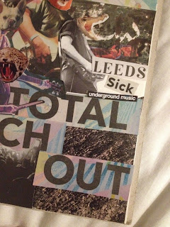
I didn't think enough about the positioning of all the elements - the title doesn't stand out enough because the size of the letters is too similar and to close to the other text. I think there should be more negative space on the page, and a better composition - there aren't any clear lines of sight around the poster.
I tried again with another poster. I played around with humans and animal heads as I've been watching BoJack Horseman recently, which also explores this element. Plus it's quite funny!
I liked the cat head on that particular body - the expression of the cat and the gesture of the hand just makes me laugh. Similarly, the cheetah head is also quite comical.
This headline on The Skinny I thought went pretty well with the animal/human crossover theme, so I decided it would be my event title - basically a music festival.
I played around with the composition of these elements a bit more than I did the previous poster. I added some background to the poster this time, instead of just stock.
This is my final poster! I like everything except the background. I think in hindsight, although the trippy colourful background and gritty image behind the characters suits the vibe I was going for of the imaginary event, it actually detracts from the characters themselves. They don't stand out enough and there's still too much going on in the image to notice what's important.
Next time I play with collage I still need to be more patient and play around with the elements of my image more before sticking things down.


No comments:
Post a Comment