Monday 24 October 2016

Study Task 3 - 3 illustrators that use print processes

Kristyna Baczynski


Baczynski makes a lot of comics and little zines, quite often using screen print or risograph print methods. She also works digitally but gives her work a screen printed aesthetic using overlaying techniques in photoshop. 

Her work is quite similar to mine in that I also like to make comics that focus on character and narrative. She makes quite a few that focus on image rather than relying on text, which is something I want to improve on. 

She sells her work at comic and illustration fairs, such as Thought Bubble! I can see my own practice developing similarly to hers (if I can motivate myself to make the products), but perhaps slightly different in that I aspire to write graphic novels and longer comic books, as well as zines and comic strips.


Luke Pearson

Luke Pearson is the writer and artist behind the highly-acclaimed ...

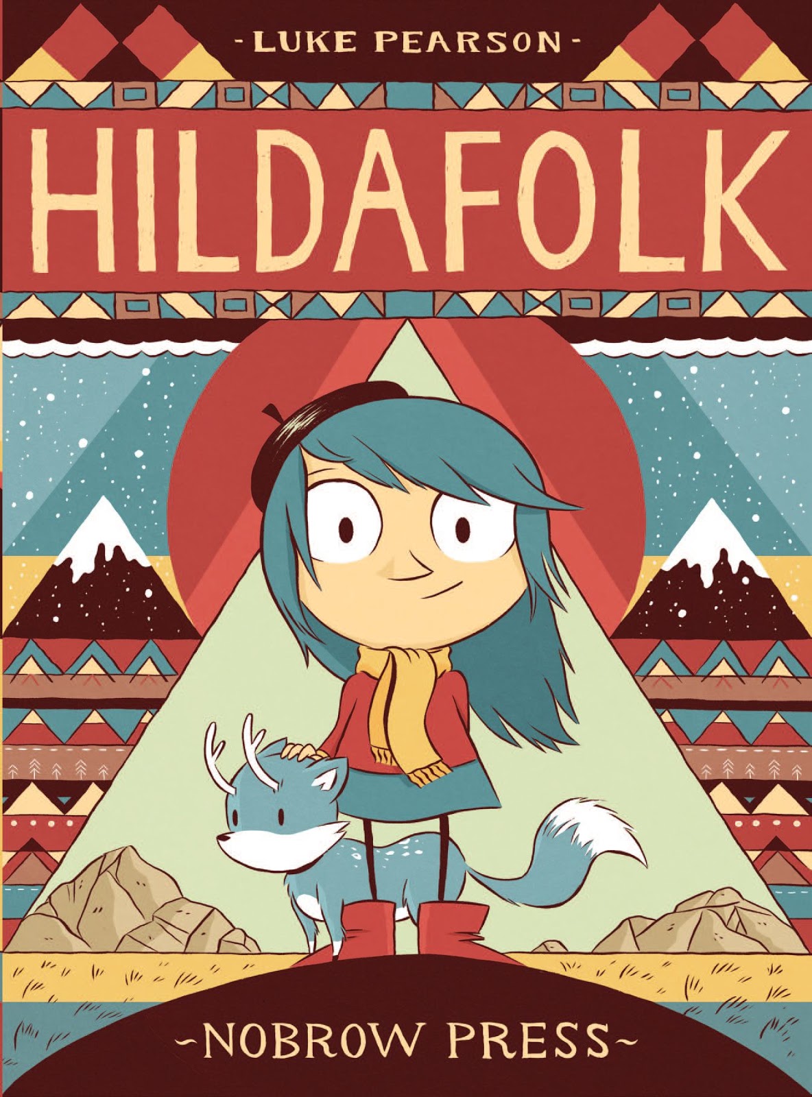
Similarly, Luke Pearson also focuses on narrative and character. He often illustrates for children (Hilda), and so his work features a lot of bright colours. I am drawn to bright and bold colours, as I like my own work to have a playful tone, even when dealing with more serious subject matter.

He is often published through Nobrow Press, which is again, not necessarily the route I want to take myself as an illustrator, but one which is similar to my aspirations. I think my work focuses more on the plot and narrative rather than imagemaking and illustration, as I feel Nobrow books do.


Natalya Balnova

Natalya BalnovaNatalya Balnova / Unfaithful Copies of Old Masters Part II

Balnova's work I admire because she screen-prints a lot, and regularly makes use of using two overlapping colours! She also makes quite funny little zines and books, again looking at character in her work.

Saturday 15 October 2016

SB1 - final images & crit


What went well:
  • The colour red was a good choice for the tone of her work. Because I have chosen to look at her work from a humourous perspective, I think the red still conveys the dark tone, but isn't too dark.
  • They are funny! Or at least I think they are.
  • They communicate her work well, as well as adding my own twist on it.


What didn't go well:
  • I rushed these outcomes. They're not as polished as I would like them to be.
  • The composition, particularly of the portrait format, isn't very well fleshed out.
  • Although I've used different tones of one colour, I think adding another colour, like black or possibly dark blue, for the lines would have benefitted the visual quality.
  • I switched media halfway through! Th watercolour I used n the landscape format was quite annoying to work with and I flt in a rush, so I switched to 'red' ink which was quicker, but the colour didn't match.


What I'll do differently next time:
  • Work bigger and shrink my work down! Many comic artists do this (and artists in general), because it is too fiddly to work at print size, and you can't see all the little mistakes as well when it's shrunk down.
  • Add a second colour.
  • Give myself enough time!
  • Work digitally - I still haven't played around with Photoshop and my graphics tablet as much as I wold have liked to, partly because of my bad time management, and partly because I'm scared of failing.
  • Don't be scared of failure!
I might re-do these images at a later date, to a standard I am happier with.


Thursday 13 October 2016

SB1 - development of chosen ideas

I've been quite ill this week and not really felt motivated to do work, so I've got back into old habits and left the final images until the last minute.

I've decided to take the advice from the last crit session and not do a 4 panel comic for the square format, as I think it would be too small, even if I work larger. But because of time constraints (i.e. the night before), I don't have the facilities at home to work larger and scan in my images and reduce them down to print size. Because of this I've decided to work with analogue media, even though I thought this brief would be a good opportunity to develop my digital skills.

I did just get some new watercolour paper though! And I do like working with ink, so these comics could work well.

Some figuring out of composition:


And colour:


And pose:


Friday 7 October 2016

Studio Brief 1 - Idea Pictures: initial roughs

I didn't manage to get all 60 roughs done, but I did still come up with quite a few ideas for comics:


After the feedback session, I'm confident that comics will communicate the author's life and work in an effective and humourous way!

The next steps are to start thinking about which comics to continue with, colour, and composition within each frame of the comics.

I think red would definitely be a good colour to start experimenting with, as a lot of the stories in The Bloody Chamber have themes of blood, but I could also use pink, as her stories are quite feminist, and pink is a classic symbol of femininity (and actually a hue of red).

Saturday 1 October 2016

Study Task 2 - Editorial Illustrators

Tom Gauld
I wasn't really that excited about coming up with visual metaphors, but Ben showed me Tom Gauld and reassured me I could focus on comics for the first brief!

 
  • Lo-fi short comic strips with a focus on narrative, character and humour, which are three things that are important to me in my work.
  • He uses a limited, muted colour palette, making the images simple (and perfect for editorial) so as not to detract from the main focuses of the image: the narrative and humour.
  • His process is very simple - it looks like it's drawn with a fine-liner or possibly digital, and doesn't involve a complex use of composition or line, but incorporates mark-making to add depth.
  • The subtle humour and simple images work perfectly for editorial because they don't take too much figuring out, like visual metaphors, but add a bit of entertainment to an otherwise possibly boring article.


Scott Garrett


  • This artist has a more similar style to me - still quite simply drawn characters, but with more complexity than Gauld, giving the images a bit more depth and the potential to tell more of a story with other subjects of the image, like the background.
  • He also uses a limited colour palette sometimes, which helps to convey a mood and not distract too much from the text of the article it is supporting.
  • His production process is clearly digital, but from the composition of some of his images, I can tell he's used roughs to figure out the placement of certain objects or expressions for example.


From looking at these artists (and a few others from the presentation/Heart agency), I think the direction I want to take brief 1 in is to do comics. I know I want to make comics and graphic novels in the future, and i think the best way to start specialising is to do just that!

So for the editorial images we create I'll focus on funny little comics!