Saturday 26 March 2016

COMIX! Development

I started developing some initial ideas for comics using roughs:

I also constructed an ordered chronological list of comic ideas, with an approximate poster layout:


I'm not sure whether to have 20 comics or 16 on the posters - in theory I could fit 20, but there might not be room for a title and the text in speech bubble may be hard to read.

Also as I was developing my ideas, I went back to principles I learned in Visual Language - drawing the same thing out over and over until you get it right! It really helped - Putin's face is really hard to draw for some reason!


Tuesday 22 March 2016

Persons of Note research and ideas

I was having kind of a bad week last week, so I missed the first crit because I hadn't done much research beyond wiki (yikes), and couldn't face coming in. However, now that I'm home for the holidays and have my family to support me, I've been feeling better and got some research done!

My 3 persons of note are:

  • Noam Chomsky
  • Valentina Tereshkova
  • Prince Buster
I'd only heard of Noam Chomsky and even that was vague, I wasn't sure who exactly he was or what he'd done in his life.


When I was doing my initial Google searches, I had a couple of ideas for comics for each person! I love drawing comics and inserting humour into my work where I can, as I did in the very first brief we got (typology poster), as well as a little bit of my own personality.

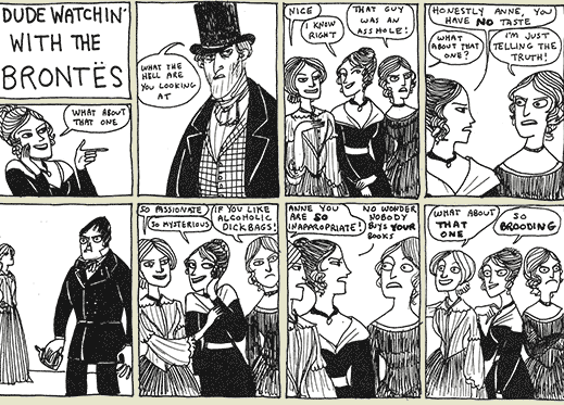
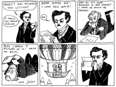
In the last week of term I did manage to venture out to Travelling Man to buy myself something to cheer me up a bit, and I got Kate Beaton's anthology of comics, Hark A Vagrant, which I've been wanting to buy forever. Reading the book was what gave me the idea to make this brief all about comics! Kate Beaton makes funny little comic strips about historical figures and literary characters, based on real events (or fictional if it was a character), but inserting modern humour. 


These are just some of my favourites. I love her line quality and use of pen and ink textures - really simple but there's something about the line quality and low-fi almost childlike drawing that gives the work that added humour. I figured this brief would be a good chance for me to further my development and come out of my analytical shell in terms of my visual signature.

I figured that whoever I ended up choosing out of the three I was given, I could create lots of little comic strips based on things they did or events in their life etc etc, and arrange them across the 3 formats we were given.

SO

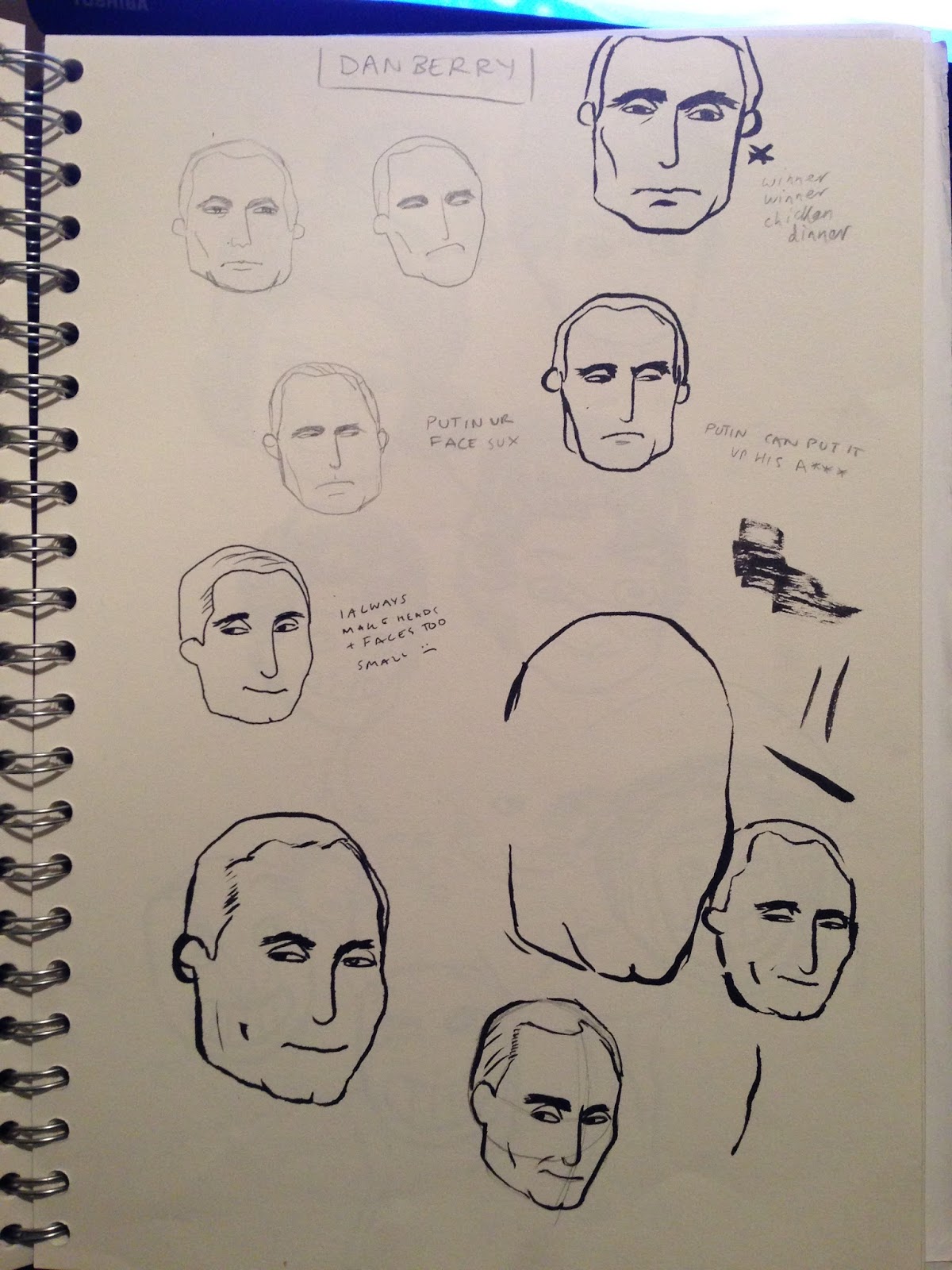
I read some stuff, watched some stuff, listened to some stuff and then made some mind maps, which is how I used to like working at school when developing ideas:


As you can see, I had the most ideas for Valentina Tereshkova! I really enjoyed reading things about her life, and I came up with A LOT of ideas for comic strips. I had a few ideas for Noam and Buster, but I just wasn't as interested in communicating them. I found wrapping my head around Noam Chomsky's theories on language quite difficult, but I was quite interested in his political activism in his later years. There were also a few aspects of Prince Buster's life that I found interesting, like his musical feud with Leslie Kong, but I just didn't have the same wealth of ideas that I did with Valentina!

Matt also made me think about something in the last brief. Because I was doing musical genres in cities, I picked iconic figureheads who all happened to be male, and he asked where the women were. So I was also influenced to do a woman. 

Girl power!

Tuesday 15 March 2016

OUIL404 Visual Language Evaluation

1.  Which practical skills and methodologies have you developed within this module and how effectively do you think you are employing them within your own practice?

·         As in the last modules, I’ve continued to develop my use of roughs, particularly towards the end of this module with the screen print fan art brief. I enjoyed figuring out the elements and placement of these elements within the frame just in quick pencil sketches and/or simple colour.
·         I’ve developed my confidence with elements such as shape and texture that I wasn’t previously that confident or interested in. the simple tasks focusing on these elements encouraged me to re-think my stances on such elements, and encourage me to consider employing them in the future.
·         As well as developing skills in elements I wasn’t so confident with, I’ve also had to develop my skills with elements I thought I knew very well. I often stick to using black line, and this module has forced me to consider not only other ways of image-making, but also the quality and value of the lines I use.
·         I think my growing confidence with using colour shows as I progressed through the module – beginning with black and white line drawings and finishing with a bold pink and blue screen print.


2. Which principles/ theories of image making have you found most valuable during this module and how effectively do you think you are employing these within your own practice?

·         The most valuable theories and principles I’ve learned from this module came from the second brief. Although I’ve been told fleetingly of the elements of line, depth, value and frame throughout school, we’d never done such deconstructive tasks specifically focused on each element, and these studies really helped me to think about the composition of my work and how it influences and affects the viewer.
·         The use of studying the key elements of composition have particularly influenced my work in other modules, especially the vector brief in Visual Communication.


3. What strengths can you identify within your Visual Language submission and how did you capitalise on these?

·         I think my strongest point within the module is the fan art brief. As it was a topic I could choose myself, I was obviously very interested in the work I was producing and spent a lot of time planning the final artwork using roughs.
·         I think roughing and planning in general has started to become a strong point within my work and practice. I still do have a lot to develop, particularly starting to incorporate colour into my roughs more often, but over the course of this module and others I’ve definitely learned the value of planning an image.
·         I’ve started to think more analytically about how my work is composed, and this translates across to other modules, using elements such as line and depth.
·         I actually really enjoyed this module. I didn’t really realise until I started to evaluate it, but I’ve actually learned a lot and have started to inform my practice with the elements of visual language, and I think I’ve developed as an illustrator from where I was at the beginning of the course.


4. What areas for development can you identify within your Visual Language submission and how will you address these in the future?

·         I mentioned struggling with depression in my last module evaluation and on my blog, and so there is also a chunk of the module within the first brief where I haven’t completed as much work as I have wanted to. However, despite this, I’ve tried my best to catch up on tasks and keep blogging about what I’ve learned from this module.
·         Some tasks, like the collage task, I could have spent more time on composition and crafting. However, even some tasks where I wasn’t 100% happy with the final outcome, I still learned a lot from and had fun playing around in the development and planning stages, such as with the texture task.
·         Particularly at the beginning of the module with tasks such as using line and mark-making, I could have tried harder to include a broader range of attempts and experimentation, but I think I have improved on my commitment over the course of the module.


5. In what way has this module informed how you deconstruct and analyse artwork (whether your own or that of contemporary practitioners)?

·         In terms of my own work, I found the second brief particularly helpful in being critical about my own work, and started to learn to view my image-making from an outside perspective.
·         I certainly find it useful to think about images in terms of how the are planned and composed, as good composition can really make or break illustration, depending on the brief.
·         Attempting to deconstruct other artists’ work is useful in working out the meaning and purpose behind the image, and learning how I can also create similar meanings within my work, or how I can present my purpose.
·         I have definitely gotten better at deconstructing and analysing my own and other practitioners' artwork, and my Pinterest account has also encouraged me to do this - I now try to think about elements such as depth and line of sight as well as aesthetic qualities of the visual signature and how these elements portray mine or another practitioner's intent.


6.How would you grade yourself on the following areas:
(please indicate using an ‘x’) 

5= excellent, 4 = very good, 3 = good, 2 = average, 1 = poor

1
2
3
4
5
Attendance


x

Punctuality


x

Motivation


x


Commitment


x

Quantity of work produced


x

Quality of work produced


x

Contribution to the group


x

The evaluation of your work is an important part of the assessment criteria and represents a percentage of the overall grade. It is essential that you give yourself enough time to complete your written evaluation fully and with appropriate depth and level of self-reflection. If you have any questions relating to the self-evaluation process speak to a member of staff as soon as possible.


Monday 14 March 2016

Value


I got my photographer flatmate to take this picture of my outfit. It's not the best thought out photograph, as I was a bit rushed for time (had to get a train), but the basic experimentation with colour is there.

I've recently used the colour picker tool in the postcard brief for visual language, picking colours from album covers to match the people who were representing the cities I chose. It's a simple but useful tool for creating palettes that work well together.

I often look at other artists' work and even photographs for inspiration in colour palettes for my own work, and it's a useful task for getting the balance of colour right. There's only a tiny bit of yellow in my outfit but your eye is immediately drawn to it, so in a way it does dominate the image. It's also quite useful to use a muted palette with one or two complimentary colours, such as in the palette.

FINISHED POSTCARDS


What went well:
  • I managed to complete a task using vectors! The thought of this was quite daunting at first because I'd never used Illustrator before, but once I got the hang of it, it wasn't so bad to use, and is a skill I might attempt to refine in the future, if I get another brief where it seems appropriate. Perhaps CoP
  • I strayed from my usual practice of focusing on detail, and instead focused on shape, symbol and colour.
  • I looked at a few artists to help influence my work, using methods and skills from their practice to influence my own work.


What didn't go well:
  • Time management! Still something I struggle with, especially during the initial stages of a brief. I can get stuck in if there's a buzz in the studio and everyone's working right after we're set a new brief, but then my motivation can start to lack once we have to manage our own time.
  • I'm not sure that these final postcards are innovative enough. I started out quite ambitious but was forced to hone down my ideas due to time restraints and my limited skills with Illustrator, as well as own ideas.
  • I'm not sure I 100% stuck to the brief - these don't necessarily immediately portray cities, as the brief suggests, I focused on character and people instead, which is what I'm passionate about, but could have considered the cities themselves more in my final outcomes.  


What I would do differently next time:
  • Manage my time better and start the process of ideas generation sooner.
  • Generate more ideas directly related to the brief, i.e. the cities rather than the people.
  • Innovate!


Saturday 12 March 2016

Last two postcards

After simplifying Kurt and Liam, I decided outright to start simple with Biggie Smalls and Sid Vicious. I tackled Sid first because I had a Noma Bar-esque idea for him:


 For Biggie Smalls I tried to somewhat emulate the work of Stan Chow by using gradients:


However, I realised I was actually outright copying his style, rather than just being influenced by it, especially considering Chow had done a portrait of Biggie already. I decided to go back to simple shapes and forms, but kept the gradient in the crown.


Friday 11 March 2016

More development (postcards)

After my last post I decided to look specifically for existing vector illustrations of the four people I chose to represent my cities, specifically work by Stan Chow and Noma Bar.

I wasn't expecting both artists to have made portraits of all of them, but I found a few:


  • The first one is actually Noel Gallagher, not Liam, but it's an example of how features can be exaggerated and the people turned into easily identifiable caricatures.
  • I love Chow's use of gradients in his work - it gives just a little bit of depth and complexity rather than symbolic flat colours.
  • Kurt Cobain by Noma Bar I really love. Noma Bar is incredible at using objects and motifs incorporated into portraits to further represent who they are. For example, the music notes in the sunglasses, and in an earlier post, Amy Winehouse with facial features made up of a spoon of heroin and a lighter. This is an example of how simple can be really effective, and it's something I'd like to be able to do.

After trying to experiment with a more complex original idea for the portraits, I felt like simple could work a lot better. It would also be something new for me, as I like to draw details and line, rather than simple shape forms.

I made quite a few different versions of Liam Gallagher and Kurt Cobain, once I started looking at these two artists. I was inspired and influenced by their simplicity, as when I started the project having never used illustrator before, I think I was quite arrogant maybe about what I could achieve? Or was creating too much work, unnecessary work, especially when these simple portraits convey meaning just as well, maybe even better, than a very complex drawing.

Anyway, development of Liam:


So going from complex, to simpler and simpler still. The last one is my attempt at super simplicity, like Noma Bar, although I couldn't think of an appropriate associated object to incorporate, apart from the sunglasses, but I think all you need is the hair, as his was so iconic.

Development of Kurt:


Again, a similar process of complex to simple. After talking with people in the studio it was suggested that maybe the third one wasn't clear enough as to who it was, without any other signifier apart from the hair, so I made two other versions, one with a beard and one with Kurt's iconic sunglasses. I do think his face look too bare with nothing apart from the hair, and my favourite is probably the second one, as you can easily tell who it is. I like the sunglasses one but again couldn't think of a way to make use of them without copying Noma Bar.

Thursday 10 March 2016

Poster communication

For this task we were instructed to pick a famous person and represent them on a poster without using their face. I chose Kurt Cobain since I'd just been representing him in the 4 Cities brief.

I came up with a few roughs, some expanding on ideas I'd had in the previous brief, such as the white sunglasses he wore, which were iconic among fans.


I enjoyed the going back to basics in the 4 Cities brief, by using vectors and simple shapes, rather than a lot of complex detail, so I decided to do the same here.


Matt questioned the use of space around the sunglasses, but I quite like the simplicity and not using the whole frame. I placed the glasses approximately where Kurt's face would be if it were a portrait of him. Could be symbolic - the fact that he's not alive anymore. I used a blue background reminiscent of the album Nevermind.

However, this poster didn't take me very long to do, so I decided to make another while I had time. I used the song Heart-Shaped Box to create a visual pun, again using space around the image. 


I also quite liked the Pennyroyal Tea idea, but it's not one of their most famous songs, so I wasn't sure if people would get it. I guess fans would.

Ch-ch-ch-changes (postcards)


After experimenting with the geometric technique I had a couple of doubts.


  • Is this idea innovative enough?
  • Is it boring and unimaginative to basically copy a photo?
Although it may not be the most innovative idea I've had, I am challenging myself already by using vectors and attempting the geometric shape layout. And I have had other ideas!! Plus, as Matt pointed out when he spoke to me, there is actually quite a bit market for this sort of 'boring' stuff, because it appeals to the masses.


He showed me Stan Chow's work which I've seen before but never noted the artist. I like his use of shape and colour, particularly the gradients (need to incorporate that!!), and Matt also suggested that I could incorporate some innovation into my work by perhaps exaggerating some features, as Chow does.

I could enlarge Liam's hair and eyebrows, and make the glasses smaller for comic effect for example! Or elongate some necks.

Matt did also point out that I don't have super long left to do this (I know I've left it a bit late, again), so perhaps getting it done this way is the best at the cost of innovation. Oh well, at least I can maybe sell some!

After my talk with Matt I think the image at the top is a bit too complex. Doesn't need as many colours/shapes within the face to convey the meaning - simplify!!

OMG idea!!!

New idea!!! Instead of making up a character, I could use iconic figureheads of each genre, in a band hailing from each respective city.

London: Sid Vicious, Sex Pistols
Seattle: Kurt Cobain, Nirvana
Manchester: Liam Gallagher, Oasis (chose him over Noel because he has more iconic hair/glasses)
New York: The Notorious BIG (although he wasn't at the forefront of the development of hip hop in the late 70s and early 80s, he is a very recognisable figure of the genre and was born in NYC)

I could also use the eyedropper tool to pick colours based on their album covers.

Although I've thought about using the same idea of full-figure poses for these people, I don't think it's needed, it's too complicated. I think just the face is enough, or even just one feature, such as Liam, Sid and Kurt's hair and Biggie's crown. Maybe adding a tartan background or a safety pin for Sid just to make sure it's clear.

I decided to actually look at some vector art too:


I've always really liked this geometric style, but never ventured to try it before - I think it might be a good challenge for me to identify areas of light and dark and tone within the planes of the face, picking out the important parts.

Or really simple visual communication, like Noma Bar.


He also incorporates props and visual motifs into the faces based on the person/movie etc. This could be interesting if I could figure out something similar!

Tuesday 8 March 2016

Slight changes!! (postcard brief)

My initial plans was to include more than just character in the postcards, particularly a location with the city in order to signify the city as well as the genre, as obviously this is about CITIES not genres Molly c'mon man.

However, because we can't use type, this is a bit difficult, as I can't type out 'The Hacienda Club' or '163rd Street'. The Hacienda Club might be iconic enough in shape to signify Manchester but I can't really find an isolated famous club or place related to grunge that would immediately say: Seattle.

Is it enough to just have characters in the genre attire? If you know the genres well you'd know the cities they came from, so I guess it's not the end of the world if not EVERYONE can immediately recognise that the postcard is advertising whatever city.

Thursday 3 March 2016

FAN ART FINALE!

The finished posters!


Things that went well:

  • None of the images came out 'perfectly', but there are a couple where the blue layer kinda fades on the left side, which actually helps give the image more depth, as my aim was to make it look like light was being cast on the figure.
  • I used roughs a lot during this brief, a lot more than any other brief I think, and they really helped me to figure out my composition and problem solve to get the best result.
  • I also started to incorporate colour into my roughs more, which I haven't done as much previously, and it really did help me to work the specifics of the final image.
  • I actually like the prints on the cheaper papers best, as the colours came out brighter on the whiter paper, and the lines were somewhat thinner.
  • The colours came out well on all of them though - I planned to have them overlap and create darker areas of line and shadow, and it worked really well!
Things that went wrong:
  • The text at the bottom giving the details of the imaginary gig aren't very clear, as the half-tone dots start to become smaller and more spaced out, so the writing blends in and becomes hard to read unless you're looking at a certain angle. I did consider having this text in blue instead because of this, but thought it would draw the focus away from the band name in white.

This has probably been the task that I put the most effort into, because of the nature of it. I was obviously interested in the brief and need to work on translating that passion into every brief. Find the fun and the job's a game, Mary Poppins and whatnot.