Monday 29 February 2016

4 Cities - Initial Ideas

The idea I've decided on for this brief: music genre origin cities!


  • London - punk
  • Manchester - britpop/'Madchester'
  • Seattle - grunge
  • New York - hip hop
I also looked at the origins of black metal in Oslo but decided the overwhelming themes of murder, suicide and Satanism were a bit dark...


After a bit of research on the fashion and hang-out spots of each genre and city respectively, I've come up with a sort of plan for the postcard layouts:

  • A CHARACTER: look at fashion and hairstyles of the genre and pick iconic clothing so the genre is easily recognisable
  • A LOCATION: a famous club/place in the city associated with each genre
  • AN ACCESSORY (?): a lifestyle signifier, possibly a different kind of drug
  • A BAND (?): logo of a prominent band of the genre on a T-shirt, or a music format with their album artwork/colours (NO TEXT!)
  • COLOUR: colour associated with the genre, either to do with a band or clothing

I like making lists and planning things with words rather than draw straight away, as otherwise I forget my ideas. So I have a mini plan for each postcard:


And some initial fleshing out of ideas:


Fan Art poster development

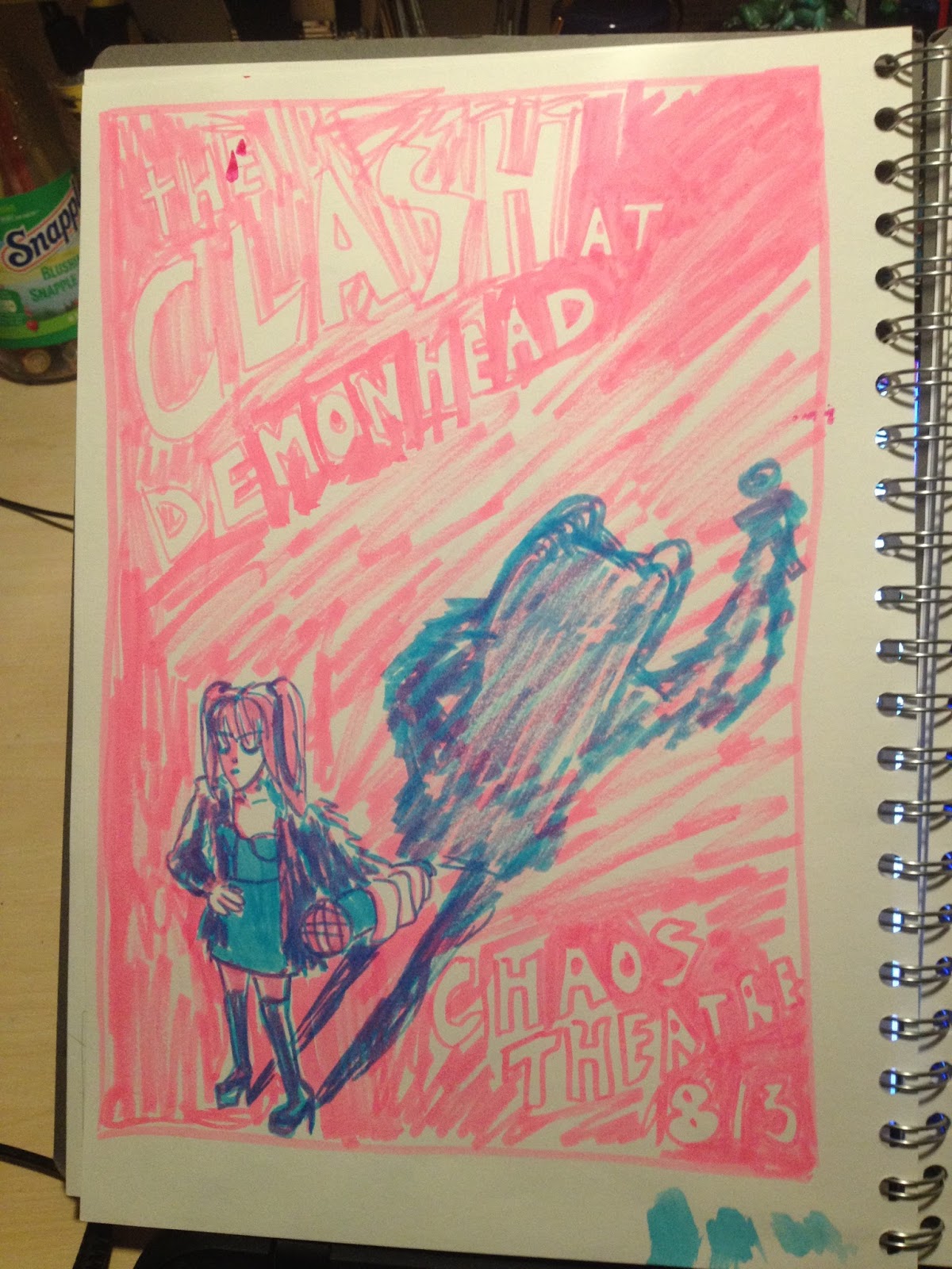
After looking at existing gig posters, I was particularly inspired by the Pulp one - just a simple figure with the basic information about the gig. I started playing around with Envy's pose and figure as well, doing a few studies based on Flashdance among other things. From these I pinned down a few ideas and played around with the colour and composition. I already knew I was going to do bright pink and turquoise as these are the colours of Ramona Flowers' bag - very iconic among SP fans.


This is probably my strongest idea compositionally - I like the viewpoint from above and the shadowleading your eye around the image. I'm still messing about with where the text would go in this one, but it's my favourite at the moment. Jamie also suggested having the shadow go off the page instead of trying to fit it all in the frame, which I'd not thought about but I think will work better!


This is another idea I really like but is a bit boring compositionally. There's also not a clear line of sight around the image, as James pointed out. I quite like the simplicity of it though, but could maybe make it more interesting and work better as illustration by changing the viewpoint to a lower angle so she looks more imposing, or move her to the left and have her arm lean behind her in the same direction as the text, like so:


 Finally, my last main idea again used a dramatic low-angle viewpoint, to draw focus to Envy and put her in a position of power. However, as I'm trying to emulate a gig poster, I think this is maybe too narrative based for what I'm trying to convey, with Scott under her foot. I also haven't figured out the text on this one!


 One more thing I thought about changing in the first idea was to include all the band members instead of just Envy Adams. This is some existing Scott Pilgrim fan art I found, of Scott's band Sex Bob-omb:

I like the composition of this image - the perspective from above (like in my idea) and the varying sizes and overlapping of the characters to create depth.


 I played around with this idea but ultimately don't want to make to poster too complicated with too much going on, plus I think the simplicity and dram of just Envy and her huge shadow works well as a gig poster.

Friday 26 February 2016

Fan Art ideas visual research

Because of the idea I had for a gig poster, I started looking at existing gig posters for inspiration. A few I found that were interesting: 


I particularly like the simplicity of the Pulp one - just a figure in monochrome with simple colours in the background, the band name big in white negative space. The rule of thirds is clear - the areas of text are spilt into thirds of the image, and further divided by the background colours. There's also a few clear lines of sight - the strip of Blue leading you from the figure to the band to the date and place. The figure also points and looks back to the text. This is my main inspiration in a gig poster.

Similarly, what I like about the others is that they have limited colour palettes so that you're not focusing on too much information, only what's important.

Saturday 20 February 2016

Final GIFs


What went well:
  • I think the humour in the GIFs is successful, as well as the success of the 3D GIFs.


What didn't go well:
  • My heart wasn't in this brief. I was still struggling a bit with personal issues and I let it affect my work.
  • I didn't manage to complete the digital GIF for this brief.
  • I tried to update the condom GIF to be digital by editing it in Photoshop, but for some reason it wouldn't save and I couldn't work out what was wrong??
  • This was what it was supposed to have looked like:


What I'd do differently next time:
  • Complete all the tasks
  • Manage my time better
  • Create more exhaustive sketches and ideas in my sketchbook, as well as using a variety of media and approaches

Still trying to improve my mental well-being

Thursday 18 February 2016

Fan Art poster brief - ideas!

The first thing that came into my head for this brief was Scott Pilgrim! The comics by Bryan Lee O'Malley and the film. I also really admire O'Malley's visual signature and he has inspire a lot of my own work, so I thought this would be a perfect excuse to emulate that.

The first obvious ideas I had were to do with Scott and Ramona, and I played around with perspective a bit to make Ramona seem strong and Scott delicate in her arms, as is kinda portrayed in the comics:


However, I felt this was a bit safe and boring, and I felt like I could achieve a better composition pursuing something else, maybe with more characters??

I always liked Envy Adams in both the comic and movie, so another idea was to have her fighting Ramona somehow, a face-off:


However, after drawing these roughs, I decided it would be more interesting to focus on just Envy, rather than either of the two main characters. I think it would be quite cool to do an imaginary gig poster for her band The Clash at Demonhead:


This is only one of the first roughs I've done, but I'll carry on with it at a later date. I really like the brush texture still though, and I think it suits the indie/alt rock genre of the fictional band (songs actually by Metric in the movie). It's also quite similar to the font used to the movie poster:


Another GIF!

This lil guy is done! I have done brief animations before on foundation and remembered how infuriating it can be!

I liked using texture on the hat as I like the way it moves in its own right through the sequence. I'm definitely getting better at incorporating texture into my work.

Monday 15 February 2016

Crit

I admit I haven't been as invested in this brief as I could have been. I should be excited about character but I do prefer people as opposed to personifying things and animals. I hadn't really done enough for the crit.

After getting feedback on some of my ideas, a lot of people said they liked this guy:

So I started playing around with the potential of using him in a GIF, maybe drooling into his cup as he sips. I think I'll use blue as it's quite a melancholy colour.


More GIF experimentation

I quite liked doing 3D modelling although it was fiddly, so I decided to expand on another idea in 3D. I decided to try my condom idea!


Trials and tribulations:

  • As the condom is curved and still somewhat lubed, I had trouble sticking the googly eyes on with their sticky backing, so had to opt for glue. The eyes also tended to fall to the sides, so the eyes are never really facing forwards, but often to the sides of the head. This is quite comical though so I didn't mind too much, just gave the occasionally jiggle when they weren't in the right place.
  • For the first GIF I didn't use a tripod and just my phone camera, but this time I borrowed a tripod from my flatmate and used a better quality camera, so the frame didn't move as much as in the first GIF.
  • However, the condom did move! It rolled a lot, so it was hard to tell if I'd put it back in exactly the right place, so I took multiple shots to be sure.

Simplifying!


I really enjoyed being challenged by this simplifying task. Going from accuracy to the bare bones of representation. Figuring out which bits are the most important part of an object in order to convey it simply but still recognisably. Graphic design!

We were supposed to do 8, but I had more than 8 ideas of ways to simplify in order to come to some kind of conclusion.

As someone who usually does quite analytical, detailed drawings, this task was really useful in thinking outside the box of imagemaking and ways to convey meaning.

Tuesday 9 February 2016

Frame and arrangement

My initial ideas for this task were fairly obvious ones, which I wasn't happy with. I slowly developed them by thinking about the viewpoint - where is the perspective? 


I thought the two most interesting ideas I had were the high angle perspective of the butterfly very high up in the sky, and the elephant and figures very tiny in the distance. This gave the image a sense of depth and created focal points and lines of sight around the image. I played around with roughing this one a bit more, to tidy it up a bit, and look at what changing the size of the elements did.


However, ultimately I chose this idea to create my final image. Again, I like the perspective and sense of depth created from this idea. The elephant's trunk reaching out and appearing larger, and then a smaller human figure atop the elephant, with the butterfly dominating the bottom half of the image.


The final image

What went well:

I tried to play around with different line quality, tone and texture of washes to create depth and a more visually interesting image. I used the frame to crop the leaves, and changed the sizes of some leaves, to create the sense that the viewer is also peering through the trees, like the elephant.


What I could have done differently:

However, I didn't pay as much attention to the human figure - I don't think it stands out enough, or is anatomically correct. I could have made the elephants trunk larger to create the illusion that it was closer to the butterfly, as obviously the butterfly is not bigger than the end of an elephant's trunk.

I could have done more roughs to prevent these issues - I rushed this task too much and should have spent more time on it to get a better outcome and a better composition.


First GIF development/evaluation - issuu

Hark, a GIF!


A bit of GIF experimentation! For development details/evaluation see the issuu publication that follows.

GIF character development

Some more character development: inspired by my hunger and thinking about what I was gonna have for dinner later!


I like the idea of doing quite childlike drawing and maybe stepping away from black line and adding a lot of colour.

Monday 8 February 2016

Artist research GIFs

From the presentation on this brief, I really like some of the GIFs we were shown.

Lilli Carre
This one is so simple and playful - I love the action of the lips falling off, and the simple construction of the face from textures and simple line.

Rebecca Mock
This one is so simple, you hardly even notice it's a GIF at first, but then you notice the blinking lights. It's such a beautifully composed piece, with depth and a bold use of colour. It's not character based but it emphasises the effect of simplicity.

 Angus Dick
This guy just seems to make kinda stupid, humourous GIFs, which I really like. He's not really focused on really polished drawing, just the humour in the idea.

GIF character development

Originally when I heard that this was a character brief, I got really excited, like yay I can draw people! But then Matt suggested he'd like to see be be a bit more innovative with this brief and start personifying things rather than  just drawing people.

I did branch out a bit though and do some more cartoony comical drawings of people, inspired by the fact that I was tired and bloated! 


I was also interested it the potential of movement:

Some of the objects I started to look at personifying - I like the straw idea and I think that could be interesting to attempt in 3D.