Friday 29 January 2016

3D and lens 'mutation' final image


Voila! I'm quite happy with my outcome for this task. I got my flatmate who's on photography to take the pictures for me.

He took quite a few but this was the on I was happiest with, in terms of my facial expression and lighting etc.

I left my other hand out of the picture so that the fake fingers look more realistic on their own.

Here are some of the other images that didn't make the cut for the final:


3D and lens 'mutation' task!

For this task I decided to explore the idea of fingers turning into worms. My inspiration for the idea came from just looking around my room and spotting a tub of plasticine I've had for a couple of years. 

I was already thinking about doing something with animals as I'm interested in animals and have also recently been watching a lot of documentaries about them on Netflix.

Also, plasticine is super fun to play with! How many people get to do that as part of their degree???


This is the start of my modelling - I did initially have some trouble with working out how I was going to attach the worms to my fingers, as I wanted them all to be in different stages of growth. I don't have the skill (or enough plasticine) to make it look as realistic as my skin, so I thought it might look a bit out of place stuck on to my actual fingers.

Then I thought I could cover my whole hand in plasticine and then blend the worms in, but again I didn't have enough.

So then I decided to craft whole fingers out of plasticine and cover up the bases with long sleeves.


These are my final models! I thought I actually did quite well with the fingers! I think they look pretty realistic, at least from a distance.

I did have a bit of trouble experimenting with the colour of the segment separators and the bit in the middle (I'm sure there's a word for it but I don't know it). In hindsight I do think the black looks a bit too harsh and more cartoon-like, but once I finished I didn't want to take it off as I knew the black would blend into the pink, and I had run out of pink. 

Thursday 21 January 2016

Visual Narratives Evaluation

1.  Which practical skills and methodologies have you developed within this module and how effectively do you think you are employing them within your own practice?

·         Developed my use of colour and shape, steering away from my usual choice of black line.
·         I've also developed my use of research within my work, finding the personal research trips helpful in developing my ideas through taking pictures and drawing - problem-solving to see which ideas work best.

2. Which approaches to research have you found most valuable during this module. How have you interrogated your research to identify appropriate ideas?

·         I found the personal research trip very useful for developing ideas - taking lots of pictures and identifying visual themes that I was interested in through drawing.
·         Artist research has also been an ongoing useful way of exploring new ideas and finding inspiration.

3. What strengths can you identify within your submission and how have you capitalised on these? What aspects of your submission are you satisfied with?

·         I've stepped out of my comfort zone by focusing shape and colour. I still need to play around with these elements more but I feel confident that through experimentation, my proficiency with colour and shape has improved.
·         I've looked at other artists' work and I inform my practice by being aware of what other practitioners are doing, and I'm regularly looking through platforms such as Instagram and Pinterest.
·         I'm pleased with my final outcome of the module, despite struggling over the past few months with motivation problems due to mild depression. I'm proud of what I've managed to produce even if it's not my best work.

4. What areas for further development can you identify within your submission and how will you address these in the future?

·         As with the last module, I've recognised that I need to address my time management and sleep schedule - these problems in the past month or so have been exacerbated by personal issues, and I'm concentrating on fixing them by talking to people and perhaps organising timetables for myself.
·         I could have conducted more research, both primary and secondary, and experimented in my sketchbook more, with a wider variety of media.
·         I felt that because I was stepping out of my comfort zone by using shape and colour, I didn't want to push myself too hard to use media I was uncomfortable with, but I did play around with a select few in order to finalise ideas for my book.

5. How effectively are you making decisions about the development of your work?
What strategies informs this decision making?

·         My decision making process can be disorganised - for example, struggling to decide on my final idea. Talking to people about my ideas helps me to realise which ideas have potential. Although I don't always agree with their perspectives, it helps me to make realisations and decisions about my work.
·         I use my sketchbook to make decisions about colour and media, as well as continuing to use roughs and storyboards to decide what works best visually.
·         Reflecting on my work on my blog also helps shed new light on my ideas, as thinking critically allows me to realise what's working and even generate wholly new ideas.

6. How effectively have you managed this project and organised yourself during this module?

·         I've not managed this project very well. From the beginning I was struggling with sleep problems and mild depression, which has affected my motivation and time-management. Although I've been trying to work through it with the help and support of others, there have been times where I've not done this as well as I could have. As a result, there are areas throughout this module where I feel I could have done a lot better.

7.How would you grade yourself on the following areas:
(please indicate using an ‘x’) 

5= excellent, 4 = very good, 3 = good, 2 = average, 1 = poor

1
2
3
4
5
Attendance


x


Punctuality


x

Motivation


x


Commitment


x


Quantity of work produced


x


Quality of work produced


x

Contribution to the group


x

Sunday 17 January 2016

To experiment or not to experiment

Obviously I'm always experimenting in my work, and this brief is no different, but I've decided to stick to using media I'm already comfortable with for the final book. 

I've pushed myself out of my comfort zone a bit by experimenting with cut paper and collage, but since I'm also pushing myself out of my comfort zone by using lots of bolder colours than I usually would, and a focus on shape rather than line, I feel it's okay for me to experiment in these areas with media I'm comfortable with.

Friday 8 January 2016

Book project - looking at Micah Lidberg and my own development


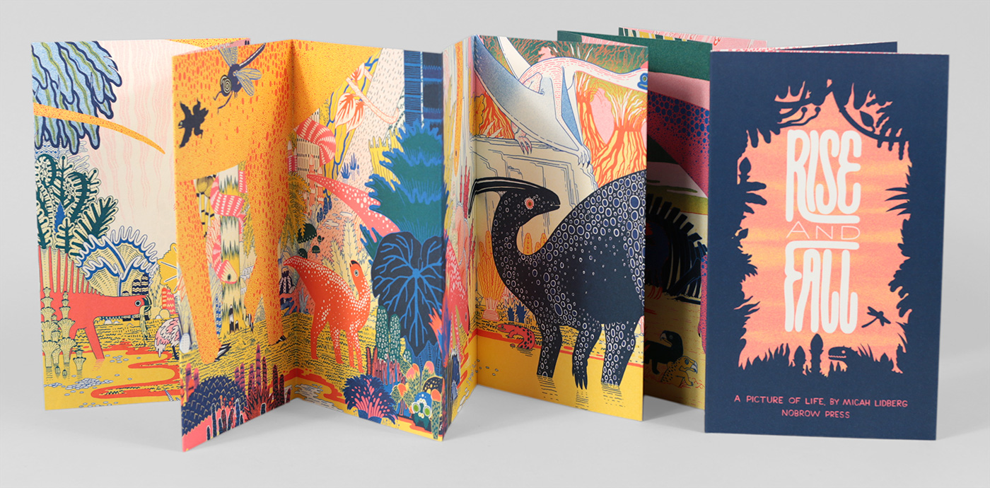
I recently treated myself to Micah Lidberg's concertina book, Rise and Fall, and gained some inspiration for my own book from his work. The colour scheme in particular really grabs my eye, and I started playing around with similar colours in another drawing of train mechanics.

I used Copic markers again, and was still focusing on shape, rather than line drawing. I think if I do this piece bigger than the size of my book (I'm thinking 150mmx150mm), then I can shrink it down using Photoshop so it will look more detailed than it actually is. This will help me to stop being such a perfectionist about my work.

I then decided to experiment with collage and cut paper, since we'd just been doing this in Visual Language:


This one didn't quite go as I wanted - I started drawing the bits I wanted dark blue in black on white paper because I couldn't find any dark blue paper in the studio, and the lighter blue paper was slightly transparent, so I thought it would show through quite well. Originally I was cutting out the shapes in dark paper but figured drawing would take less time, and you wouldn't be able to make out too many mistakes anyway. However, when I started on the coloured layers, it was harder to make out the under layer (I hadn't copied it or anything - I should have) so it was hard to get the shapes right.

So, new approach!


With this one I decided it would be best to build up the layers by cutting them out with a scalpel. However, after all these intricate cuts, I got blisters on my hands and it hurt to continue. I also used Pritt stick, and in hindsight should have invested in some spray mount. Even though it's technically unfinished, I figure I might be able to make it the inside cover and end page? It's simple enough in terms of colour to not be considered an actual page, especially in comparison to all the colour I'll have in the main body of the book.


Finally, I tried the image again but using inks. I don't really like the aesthetic of this piece for my book. I like the childlike hand-drawn quality of the Copic markers, and the markers are also brighter. Although I used ink in a previous drawing which I think will be included in the final book, it was a mix of ink and marker, not just ink. I prefer the more opaque, blocked colour of the markers.

Book Project - artist influences - Louise Lockhart (featuring Ben Eine and Kate Bingaman-Burt)

I've looked at Louise Lockhart's work as one influence for my own book project.


Why I like her work
Since within this brief we're focusing away from comics (what I normally quite like doing) and using words to tell a story, I've started going back to what we've been looking at in Visual Language - shape!

Lockhart's work exhibits a very playful visual signature - lots of shape-driven image-making, texture and COLOUR - I've never been very good at using colour, often just using black line and being too scared to fill it in in case I don't like it anymore, or not being very imaginative with my use of colour.


On the other hand, Lockhart's concertina book, Up My Street (which I've just bought because I'm in love with it), shows brilliant examples of what I'd like to be able to do with colour and shape particularly - things I've not experimented with much.


How the artist has influenced my practice
I've started to branch out in my use of shape and colour since seeing her work. This is an example of me playing around with it in my sketchbook:


One of the reasons I picked trains as my subject was because I'm also not great at drawing mechanical things, which is something that's pretty good to explore with shape and colour! I also went back to the idea within the Visual Skills module of only using a limited colour palette. I liked the challenge of choosing colours that worked well together, and it also helped me to loosen up my own visual signature and be more imaginative instead of drawing exactly what I see.

Here are some colour swatches I was playing around with in my sketchbooks (I also treated myself to some new Copic markers):

Lockhart also hand-draws her type, which is something I've always loved exploring, and another idea I had for my book is train sign typography - train name plates, vintage posters and adverts etc., so I've explored this idea too - again, using loads of colour!


Other artists (type-based) that have influenced this project:
Two other artists that sprung to my mind when I started thinking about typography were Ben Eine and Kate Bingaman-Burt. 


Eine focuses on mural typography - painting street walls around the world (mostly England - I first came across him in London on a trip on my foundation course). Although he's not a book-maker, I really admire his typography, especially his use of colour.


Kate Bingaman-Burt on the other hand is an illustrator, especially focusing on hand-drawn type. This piece of work is from her book, Obsessive Consumption, where she recorded everything she bought (every day) over a period of 3 years. The book is only a selection but she has a blog where she posted all of those drawings (up to 2014) - link here

Thursday 7 January 2016

Collage - posters for an imaginary event

The first poster I made in the seminar I wasn't happy with:


I didn't think enough about the positioning of all the elements - the title doesn't stand out enough because the size of the letters is too similar and to close to the other text. I think there should be more negative space on the page, and a better composition - there aren't any clear lines of sight around the poster.

I tried again with another poster. I played around with humans and animal heads as I've been watching BoJack Horseman recently, which also explores this element. Plus it's quite funny!


I liked the cat head on that particular body - the expression of the cat and the gesture of the hand just makes me laugh. Similarly, the cheetah head is also quite comical.


This headline on The Skinny I thought went pretty well with the animal/human crossover theme, so I decided it would be my event title - basically a music festival.


I played around with the composition of these elements a bit more than I did the previous poster. I added some background to the poster this time, instead of just stock.


This is my final poster! I like everything except the background. I think in hindsight, although the trippy colourful background and gritty image behind the characters suits the vibe I was going for of the imaginary event, it actually detracts from the characters themselves. They don't stand out enough and there's still too much going on in the image to notice what's important.

Next time I play with collage I still need to be more patient and play around with the elements of my image more before sticking things down.


Monday 4 January 2016

Struggles

Before Christmas I was struggling a bit with mild depression, caused by a number of things, including a disrupted sleeping pattern. I hit a low point in my motivation levels, and was struggling to complete work. After my initial research trip, I didn't manage to motivate myself over the Christmas break to do any more research, visual or otherwise. I've talked to Matt about this and over Christmas I've tried to fix my sleeping pattern among other things to help me get back on track.

I do really want to stay on the course and do well with it - I know I can! I've had these problems before around GCSE and A-Level time and managed to pull myself out of it. I just need to make sure I keep talking to people about it and not try to deal with it completely by myself.

I also had a talk with Matt about my ideas for the book, which was really helpful, considering I don't necessarily have as much research as some people. I think I want to focus on typography or mechanics of trains, but I know I want to experiment more with colour and shape!