Why I like her work
Since within this brief we're focusing away from comics (what I normally quite like doing) and using words to tell a story, I've started going back to what we've been looking at in Visual Language - shape!Lockhart's work exhibits a very playful visual signature - lots of shape-driven image-making, texture and COLOUR - I've never been very good at using colour, often just using black line and being too scared to fill it in in case I don't like it anymore, or not being very imaginative with my use of colour.


On the other hand, Lockhart's concertina book, Up My Street (which I've just bought because I'm in love with it), shows brilliant examples of what I'd like to be able to do with colour and shape particularly - things I've not experimented with much.
How the artist has influenced my practice
I've started to branch out in my use of shape and colour since seeing her work. This is an example of me playing around with it in my sketchbook:
One of the reasons I picked trains as my subject was because I'm also not great at drawing mechanical things, which is something that's pretty good to explore with shape and colour! I also went back to the idea within the Visual Skills module of only using a limited colour palette. I liked the challenge of choosing colours that worked well together, and it also helped me to loosen up my own visual signature and be more imaginative instead of drawing exactly what I see.
Here are some colour swatches I was playing around with in my sketchbooks (I also treated myself to some new Copic markers):

Lockhart also hand-draws her type, which is something I've always loved exploring, and another idea I had for my book is train sign typography - train name plates, vintage posters and adverts etc., so I've explored this idea too - again, using loads of colour!

Other artists (type-based) that have influenced this project:
Two other artists that sprung to my mind when I started thinking about typography were Ben Eine and Kate Bingaman-Burt.

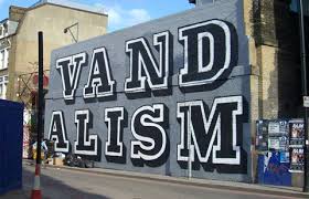
Eine focuses on mural typography - painting street walls around the world (mostly England - I first came across him in London on a trip on my foundation course). Although he's not a book-maker, I really admire his typography, especially his use of colour.

Kate Bingaman-Burt on the other hand is an illustrator, especially focusing on hand-drawn type. This piece of work is from her book, Obsessive Consumption, where she recorded everything she bought (every day) over a period of 3 years. The book is only a selection but she has a blog where she posted all of those drawings (up to 2014) - link here
No comments:
Post a Comment