Thursday 24 November 2016

Illustration Friday - Spider - development


I started trying to do this digitally, as I wanted to practice my tablet and photoshop skills by doing illustration friday, but my time management isn't great, so I ended up drawing it by hand:

Tuesday 22 November 2016

Front cover?


I was struggling between the colour of the extra texture I added to this image, but I think there's more balance in the image if the extra foreground layer is blue, otherwise the blue hair looks quite out of place, and just stuck on randomly in the middle.


Now that I've added more texture to the background as well, I think the blue foreground was definitely the right choice, as if the new monoprint texture was blue, it clashed with the hair. There's definitely more of a balance of colour with these choices.


I added a title! Not sure if I'll keep it as the final, but it's something!

More playing!

I've been experimenting more with my lino cut and monoprint textures in Photoshop today!


These are the first two I created - I'm really enjoying adding texture to my work! I'm still sure I don't want to use lino throughout my whole publication, but I might use one of these images for the cover, after a bit more work.


I changed the opacity on the blue texture layer to see potentially how the inks would overlay if I screen-printed this image. There's none of the original colour to compare it to here (there is on the next one!) but I think this image would look good screen printed, and then it would combine all 3 print processes! 


This one is my personal favourite. Although I like the textures in the other two, and they all convey the feral-ness of the character Wolf Alice, I think this one's simplicity would compliment the tone of the rest of my publication as a cover. I think screen printing it would add extra depth as the colours would probably mis-align, and it might actually benefit the image. 

I might yet add a bit more texture into the image, maybe to convey where the floor is to give a sense of depth, and play around with adding text as a title.


Monday 21 November 2016

Textures and overlaying in Photoshop


Sophia showed me this way of easily and quickly adding texture to an image in Photoshop! To give credit, Ben did originally show Sophia this.

  1. Open the image you want to add texture to in Photoshop and the texture you want to overlay (as separate files).

  2. On the texture image, press Select Colour Range and then select a lighter area of the texture.
  3. Move the fuzziness range to get the texture you want (higher is a lighter texture)
  4. Right click and select inverse
  5. Right click again and select layer via copy
  6. Deselect the eye (visibility) of the original texture image and you'll see the new layer of texture you've created.
  7. Now right click on the new texture layer in the layers panel and select duplicate layer

  8. The duplicate layer box will come up and you can choose to change the destination of the duplicate layer to the document you want the texture to appear on!
  9. Now move the texture to where you want it to be, say on the black line and where her hair is.
  10. On the layer with the image, select colour range again, but this time select where you want the texture to appear, so in this case on the black.
  11. Select inverse again and then on the new texture layer in the layers panel, press backspace, and the texture will appear on top of the black!
  12. The cheat way to change the colour is to lock the texture layer, then move the colour picker to where you want the colour, then hold alt and press backspace!
  13. Or you can do hue/saturation.

Saturday 19 November 2016

Study Task 4 - 3 animated shorts that use After Effects

INNERVIEWS from Chen Winner on Vimeo.

I loved watching this one when we were shown it in the studio - it's fascinating! It must have taken such a long time in After Effects.

One thing I really like is the moving texture - this is something I want to make use of in my own stings, in the dog show one for example, I want to have the floor moving across. I also like how Winner has kept the screen printed look by using overlapping colours.

How We Got To Now / Montage (Emmy Winner) from Peepshow Collective on Vimeo

In this one I like the combination of different aesthetics, some collage, some hand drawn lines. I also like how the type seems to be written on to the screen - I'd like to learn how to do that.

WILDWOOD by Colin Meloy, illustrated by Carson Ellis from HarperTeen on Vimeo.

This one is quite simple, but I like the use of layers - how the characters and animals seem to move through the trees.

Wednesday 16 November 2016

Better lino!

After talking to Ben, I went to the print room and had another play around with lino:


I've enjoyed using lino in the past, and this time I tried to take Ben's advice and just play a bit more, trying not to think too much about my personal style.

I think because my style is quite line-based, lino isn't necessarily the print process for me. I do enjoy it, but the prospect of printing my whole book using lino doesn't appeal to me - I'm not sure the kind of aesthetic achieved by lino is the kind of aesthetic i want my work to have.

However, I do want to continue to play around with print processes, since I've been lacking motivation this term, and I want to play around with texture particularly - something i've not done much of before - which is what lino and monoprint are perfect for. I also want to take these textures into photoshop and play with combining them!

At this point in my practice, I'm fairly confident that screen printing will be the most appropriate method for producing my book, but I could still work on incorporating some textures from other print processes, especially while i haven't actually started any screen-printing yet.

So the next step is to create some monoprint textures!

Tuesday 15 November 2016

Peer reviews and talking with tutors

I've been having a tough time this term, struggling with motivation among other things - I'm aware that I'm a bit (a lot?) behind everyone else.

But after the peer review session and a chat with Ben, I feel a bit better about my practice.

One of the main things I struggle with in my work is that I'm a very text-based illustrator. Not just in my final images (I love making comics/narratives), but also in my sketchbook. When we have crits and I see other people's sketchbooks and work, I'm always intimidated by how much drawing and other visual work they've produced.

The way I work is by making lists, mind-maps, and other text-based ways of showing ideas, so when I see other people's sketchbooks and they have far more, or a higher quality of visual work, I always feel a bit overwhelmed and I think that makes me shut down more?

I'm very ideas based and sometimes I forget that that's okay! Although I definitely do need to crack on with some visual work too.

After I post this, I'm going to get down in the print room and make something!

One of the things I spoke about with my counsellor is my motivation/stress. We identified that I have a lot of motivation (procrastination?) for other creative projects (for example: selling things on Etsy, personal work, and a birthday present for my mum), but none for my uni work. The main difference obviously being that my personal projects are for me and university work is marked. Obviously, still being on this course, I do love drawing, but I think being a bit of a perfectionist, the stress of producing work that is eventually going to be seen and judged by others is a lot of pressure for me to deal with. The way I deal with stress is to shut down and not deal with it until I absolutely have to. This is an ongoing problem and I need to identify ways to cope with stress and find the fun. I'm still learning.

SO

Suggestions (from peers and Ben):

  • GET IN THE PRINT ROOM!
  • Take one idea (my favourite) and produce it in different ways - lino, mono, screen print etc.
  • Loosen up - have FUN drawing
  • Make storyboards
  • Take ideas into digital - combine textures
  • Work bigger, looser?
  • Introduce colour? - I draw in black line/pencil a LOT

Ben gave me one artist to look at: Yann Kebbi


Ben pointed out that the characters in this image are all drawn in different ways and styles, and maybe that's what I need to do in order to have fun and maybe find my style?

That's one other thing I'm struggling with - what is my style?! How do I draw?

I think that's been holding me back too - as I said before, I'm a perfectionist, so I'm very aware of the fact that I don't really have a style I'm comfortable with yet. I don't know how I draw people.

Over summer and a bit of last year, I was very influenced by a couple of illustrators I admire - Kate Beaton and Bryan Lee O'Malley - but almost too influenced. When I was drawing I would ask myself how they drew things instead of figuring out how I drew things. I need to find the balance between being influenced by artists and outright copying them.

So I think keeping in mind Yann Kebbi's work may help me.

Monday 14 November 2016

After Effects workshop 1 notes

Key frame animation

Composition - make new composition 

HDTV 1080 25 (frames per second)

Web video, 320 x 240
Web Banner, 468 x 60 (pixels)

Duration
Background colour

Layer - new... solid

Key frame = a value.

Position - press stopwatch on solid layer in timeline - move forward in time and move the shape to where I want it.

If realtime (in info panel) is in red, change the quality of the animation at the bottom of the composition panel. Set to auto, or lower the quality.

Hold shift and select all solids in timeline panel
Shortcut for Position = letter P

Change the colour of a solid once it's already in the composition: Layer - solid settings

Grey bar at the top of timeline (work area - basically brackets) - can adjust it to only show one area of your project - good for looping a certain part

Shortcuts:
P - Position
A - Anchor point
R - Rotation
S - Scale
T - Opacity
U - reveals all modified properties

Anchor point is like a drawing pin - stuck to the paper at that point - the shape will rotate around it.
Press and hold letter Y to manually move anchor point.


Import file, PSD, import as composition NOT footage.

Copy and paste both key frames and move them along on the timeline a bit.

Pen tool - use it to change the path between key frames - how the object moves between points.

Right click key frame - Toggle hold key frame
So instead of the rain drop moving back up to the cloud, it now looks as if rain is falling!

Gets rid of transition.

Duplicate layer

Click position to select all key frames.

Wednesday 9 November 2016

Potential screen print

I've been having trouble with my 'style' - I don't know what it is! It's been putting me off drawing for this project and extending my ideas beyond rough thumbnails. But I've been doodling the character 'Wolf Alice' in my sketchbook over and over in an attempt to find my style and doodled this:


So I liked this and blew it up a bit on the photocopier, and then traced it with blue and pink to get an overlapping third colour, and I think I have some potential positives for my screen print induction!


I might try to make the positives digitally, as I do want to work on my digital skills, but I might try to loosen up a bit and instead make rougher, sketchier positives with chinagraph pencil on kodatrace (or very dark permanent marker), and just trace freehand where the colours will be.

Monday 7 November 2016

Potential Collaboration Briefs

I've already had an animator approach me about the potential for collaboration which is promising!

These are the briefs I'd be most interested in working on, as they have an element of animation, which I'd like to try doing more of:

D&AD
National Autistic Society


YCN
THINK!

I've picked these two because I think I'll enjoy them the most - the NAS one is quite close to me, as my brother is autistic, so I think I'll enjoy researching and responding to that brief.

The THINK! one will always affect me as a young person who drinks - and again I think it will provide good opportunities for research and ideas!

Saturday 5 November 2016

Monoprint and Lino Workshops

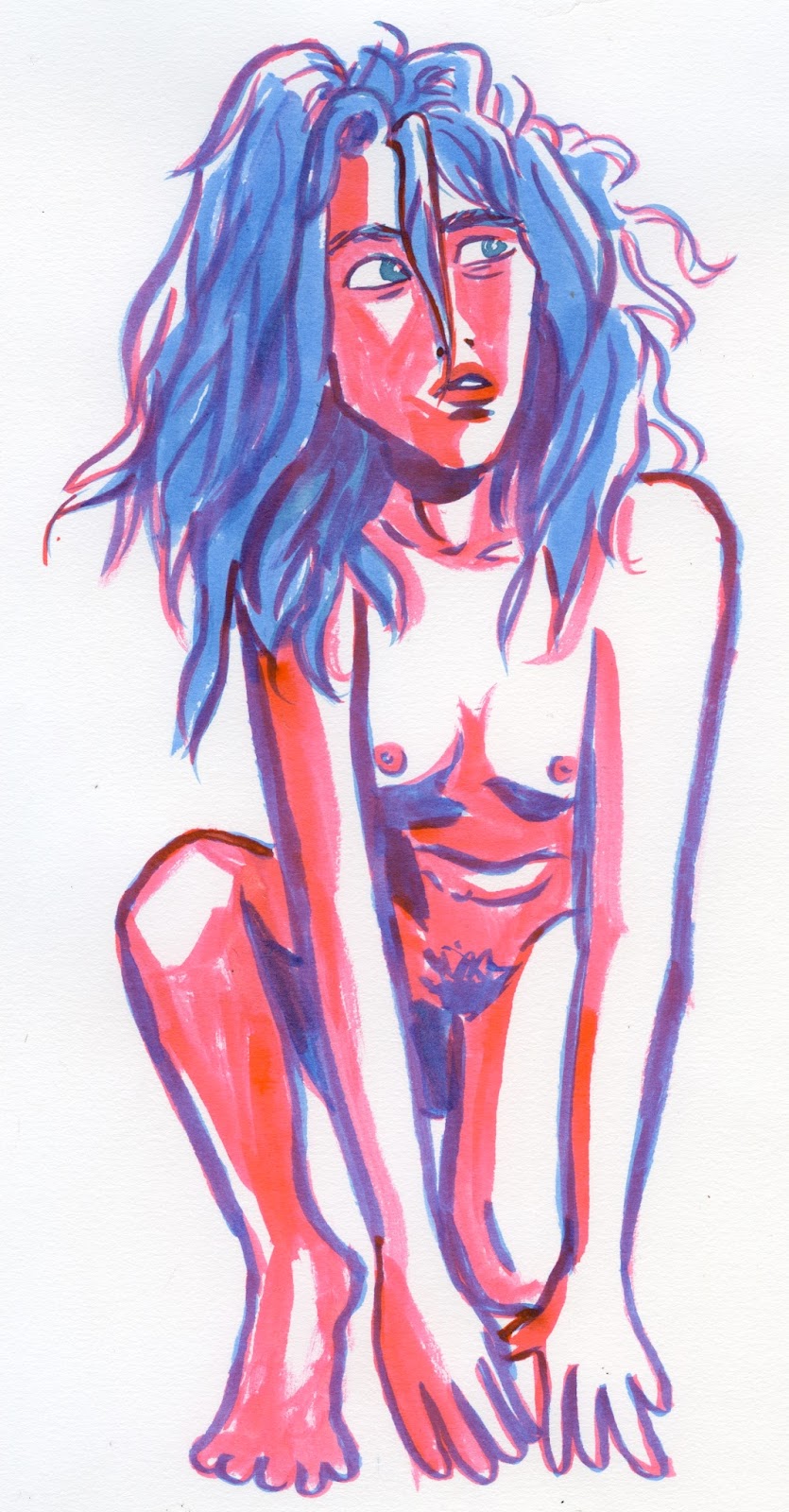
I didn't really have any final images or ideas to play around with when we had these workshops, but I've just been playing around with one idea I had from the editorial brief - Wolf Alice and the mirror:


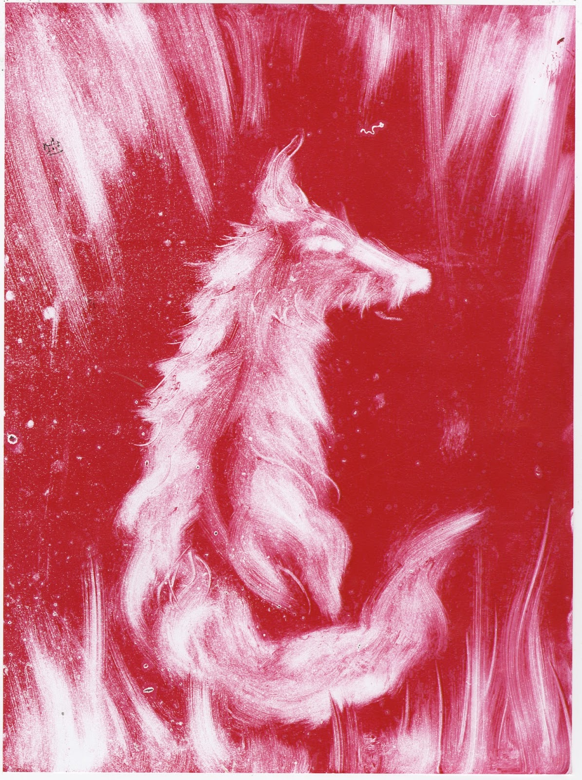
This was using the monotype method. It's probably the most appropriate to my practice as I'm very line based, as opposed to shape, but I didn't try very hard for this image, as it was only a quick test. In the future, I could draw on to paper first and the draw over it when it's on the ink pad, as with this one, I just drew freehand on to the paper, which is why the lines are a bit wonky! But this also got me to loosen up a bit.


I also tried using a cloth on a plastic board to smudge the ink to make more gestural marks and textures to form an image, but this isn't really the style I'm most proficient in or want to make pieces in, although I do enjoy it.


I made some textures quickly using a pencil and my hands, but I'm not too impressed with these - I'll have to come back into the print room and make some more interesting and more usable textures!


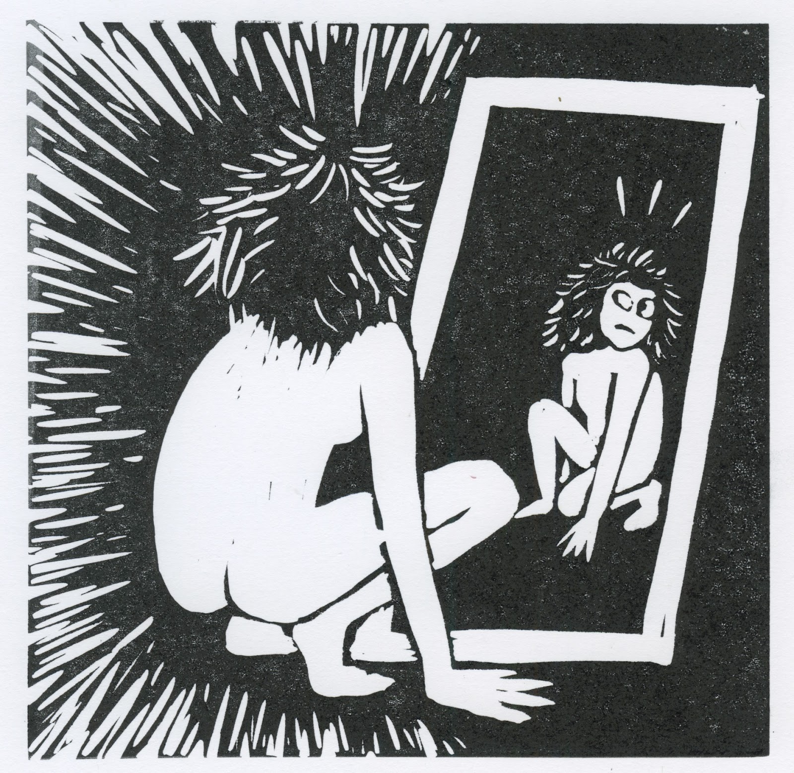
Aaaand my lino! I have really enjoyed doing lino in the past, although as I've said, because I'm a very line-based illustrator, I find lino quite frustrating. A lot of my peers have made excellent shape based lino cuts, but I feel like this method doesn't really compliment my style of drawing. However, I might have a  few more gos at it, as I do enjoy doing it, and it could be interesting to work into my final publication somehow.

Thursday 3 November 2016

Which Briefs?!

In the peer review session today I identified the Briefs I want to focus on for Responsive:


  1. UK Greetings
  2. Observer Cape
  3. Penguin
  4. Secret 7"
  5. Fumetto Comix
  6. Illustration Friday
Rationale:

I love narrative, humour and character, and these briefs give me an opportunity to explore all these elements in different ways. And in regards to Secret 7", I also love music!

Technical considerations:
  • I want to get better at digital drawing, and using Photoshop in general, and I think the quick, weekly Illustration Friday will be an appropriate brief to explore these skills, as it's a succession of short briefs based on only one word, and the image doesn't have to be spectacular.
  • The two comic-based briefs (Observer Cape and Fumetto) give me an opportunity to explore the technicalities of the comics world, such as format and even perhaps branching out into processes such as screen printing or digital if I'm feeling ambitious.
Time considerations:
  • I've made a note of the deadlines of each brief.
  • Next steps are to make a timetable noting deadlines and how long I need to spend on each brief according to whether it is big or small.
  • I will try to make time each week to do Illustration Friday, as there are no set guidelines other than the prompt word, so I can make it my own brief.

Balance of briefs:
  • I've decided that UK Greetings and Observer Cape will be my two main big ones.
  • The others will be small, particularly Illustration Friday as it's a weekly brief, but if I manage my time well I could extend any one of the smaller briefs into a bigger brief.
  • For example, I could extend Secret 7" by doing all of the sleeves, doing many different sleeves for one song, or doing one sleeve and a whole range of other merchandise (such as T-shirts, posters etc.) for one song. I could also practice this brief by doing some sleeves for last year's songs, or just songs that I like personally.
  • I could also extend the Fumetto Comix brief by doing multiple comics on A4 sheets as separate entries, and similarly for the Penguin award. Since I'm only going to attempt the Adrian Mole cover, as it most relates to my style and practice, I could create multiple covers.
I could also add the Adobe poster brief to my list if I have time, as that could also be either big or small. That one should definitely get me working digitally.

Tuesday 1 November 2016

YCN Briefs

SB2 Ideas!


As Ben suggested in my last talk with him - I should be focusing on creating my own narratives out of Carter's work, as that's what I'm primarily interested in - writing stories! Funny stories! I've done a few quick brain storms and jotted down some rough thumbnail sketches of ideas:


I'm hoping to screen print the whole book, so I'm already thinking about the colours I will use. I thing a low-middle key will work best for the kind of tone I want to portray - light-hearted and slightly dark humour. Pink or red and blue, overlaid to create a third colour too!

I'm also challenging myself to not use text, as I usually use dialogue in my comics a lot. I want to challenge myself to tell the story purely through image.

I'm going to incorporate monoprint textures into my images and maybe even some lino (the dogs?).

I think screen printing the whole book might be a bit ambitious, but if I can stay focused, I'm sure I can get it done!

I think the comic will be told in a series of different formats - maybe each page is a self contained strip, all with different formats, i.e. 4 panels, 3 panels, square, rectangular etc.