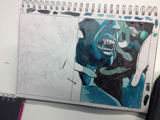
 Playing around with colour - initial thoughts went to purple as it contrasts to orangey skin tones. However I thought that colour palette looked too comic-like for this particular book cover, and took focus away from the pink title type. I picked pink because it's a classic colour associated with femininity/beauty. So then I experimented again with darker purple, but still thought it looked wrong and I wanted the snakes to be green or another cool colour, so there were too many colours and it needed to be simplified.
Playing around with media/colour for snake skin. Tried again with blue/turquoise colour palette. I think this works better for the context of the book as blue is often a negative colour, and also suits the Medusa 'monster' figure. Creates a good sense of light and tone. I also swapped the image around so that the snakes extend to the back of the book, as I was having trouble coming up with ideas for the back cover and all my ideas were too complex. From the crit, Jamie suggested this as it's simpler and it does work.
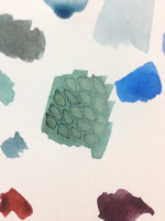
 I experimented a bit with different patterns/mark-making and colour to see what looked best for the snakes. I think the brighter greener turquoise doesn't work as it doesn't fit the palette well - I think it'll work better if the snakes are a different value of the same initial colour, or maybe the dark almost grey muted green. I like the patterns on the half-finished snakes - the ink overlay and the unjoined scales on the snake with its mouth open. With the ink overlay I would probably make it darker.
 I think it looks good though if all the snakes are slightly different colours.
 I think the blue tones work better with the pink title too - it's easier to see compared to the more realistic colour palette I started out with because it contrasts. I liked using gouache for the type aswell because it dries opaque and matt, better than acrylic or watercolour/ink. However, I might take this design into digital, where it will be easier to make it stand out thanks to layers!

No comments:
Post a Comment