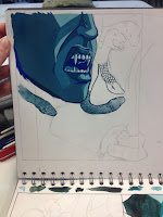
Media - gouache. I like the way gouache dries matt and opaque. Better than watercolour or acrylic paint. Emulates digital almost, but still has a handmade quality which I like.
Not sure about the blue line here - wanted to try something other than black. I think I used the wrong hue of blue though - may work better if it's a darker turquoise rather than ultramarine.
I don't think this hand position works either - there's more detail but I think it looks too awkward? Right hand facing away works better.
 I enjoyed producing this digital version! However I still like the handmade quality of gouache paint, and I'm also not sure how to go about printing the whole book cover on one piece of paper as we haven't had our print room induction, and I also don't want to pay a huge amount in town. I like experimenting with texture and gradient though - I like how the gradient makes it look like there's a light source, making the shadow on her face more appropriate. But I also think it works well just being flat dark colour - it's simpler and more eye-catching if there's less detail.
I also prefer the hand drawn type I can do in analogue media. I could spend more time creating my own font or searching for a suitable font online but since I don't think I'm going to produce the cover digitally, there's not much point. Although I can't emulate highlighter pink with gouache (which I originally thought would look good contrasting with the blue), it might actually suit a baby pink more, since it's more feminine and goes with the word 'beauty'.

No comments:
Post a Comment